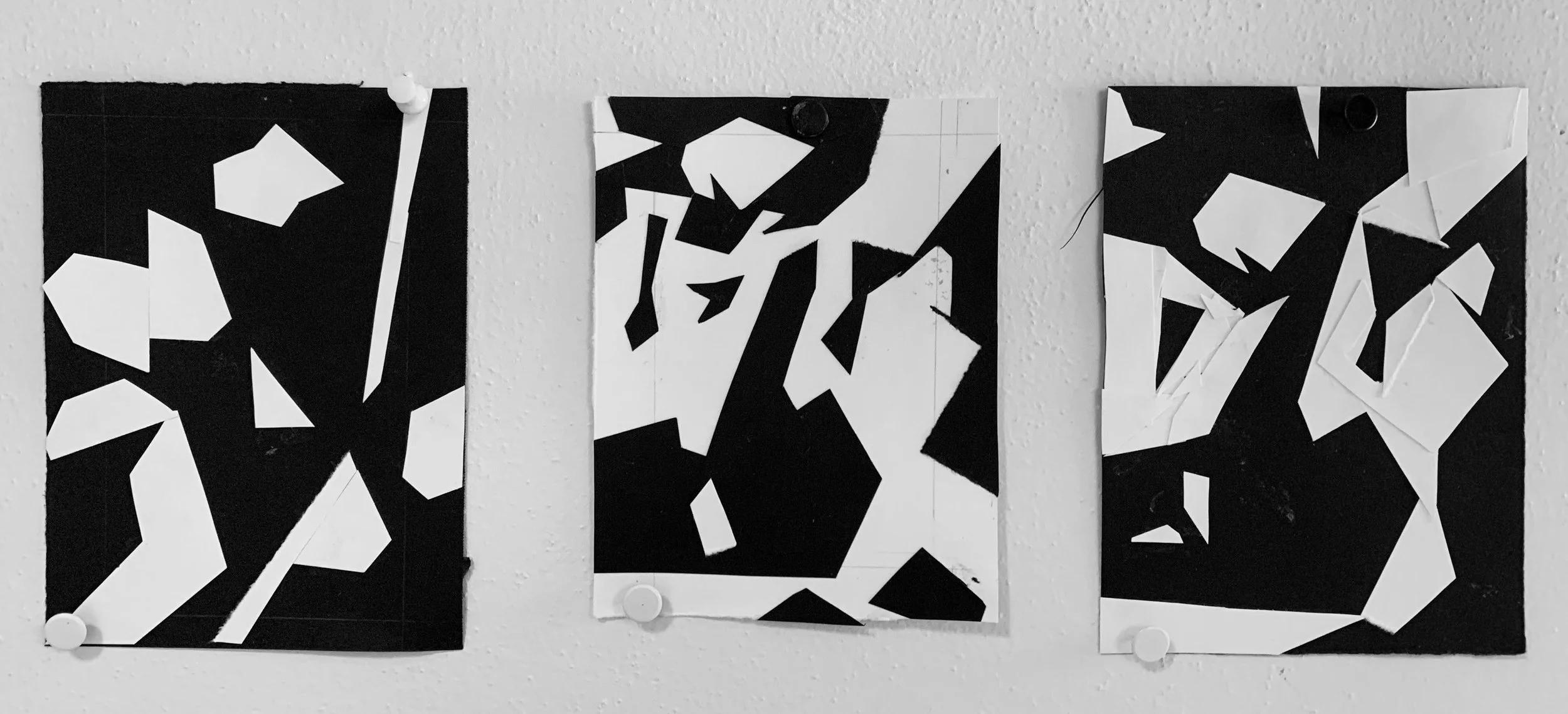
LESSON 1: Shape Shifter
With Black and White Shapes of Paper, create a dynamic interplay of positive/negative shapes.
Shapes are the foundational elements in learning to build images through color-blocking.

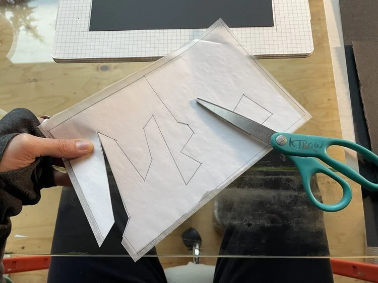
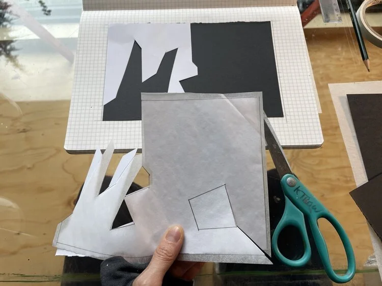
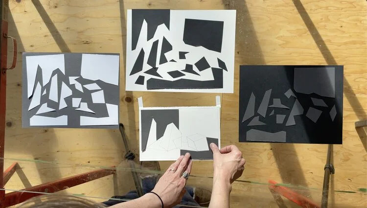
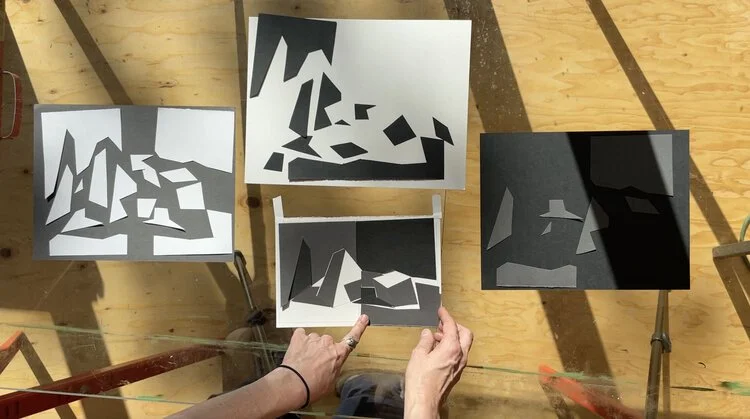
1. Cut out a series of white shapes and playfully arrange them on a sheet of black paper; Cut out a series of black shapes and playfully arrange them on a sheet of white paper. Pay special attention to the container of your rectangle and how your shapes interact with it.
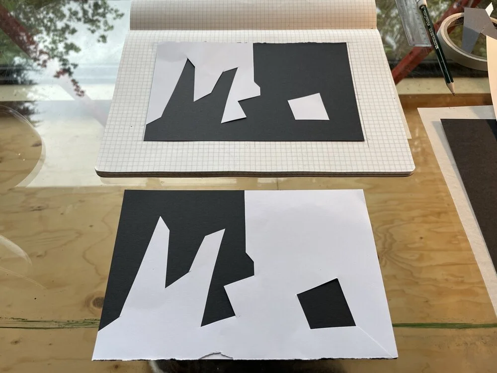
2. When you find an interesting composition, try then to recreate it by reversing your positive/negative relationship. Meaning, if your image was made with black shapes on top of white paper, recreate that same image by doing the opposite: cut-out the white shapes and place them on black paper. The image will be nearly the same, but how it was built will be different.

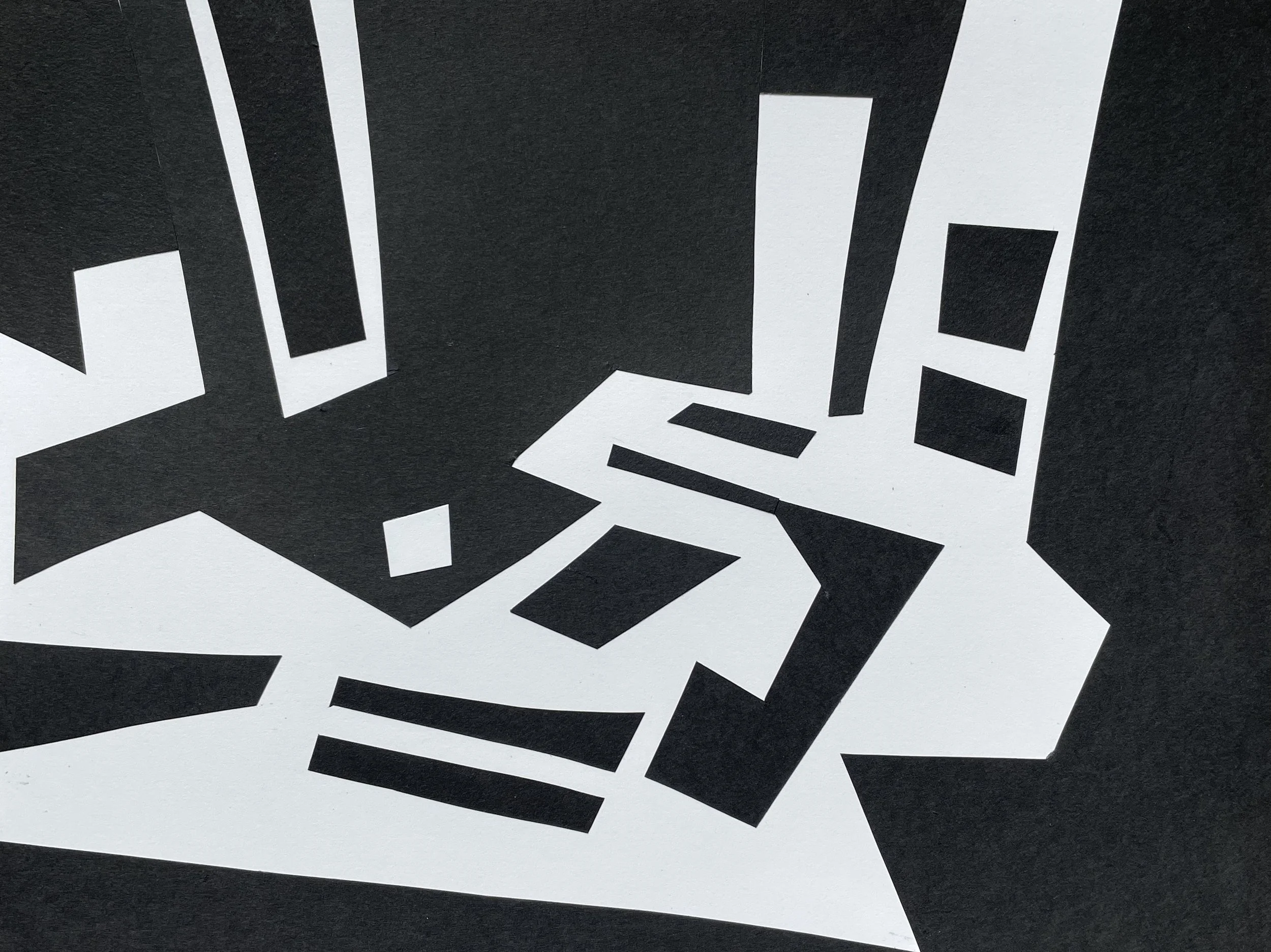
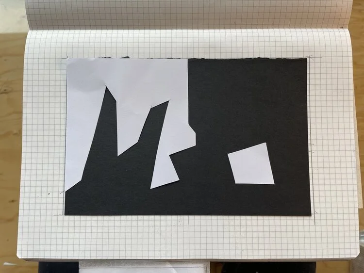
White shapes on black paper.

Black shapes on white paper.
3. Now create another version where you invert the relationships: Make the black shapes white, the white shapes black.
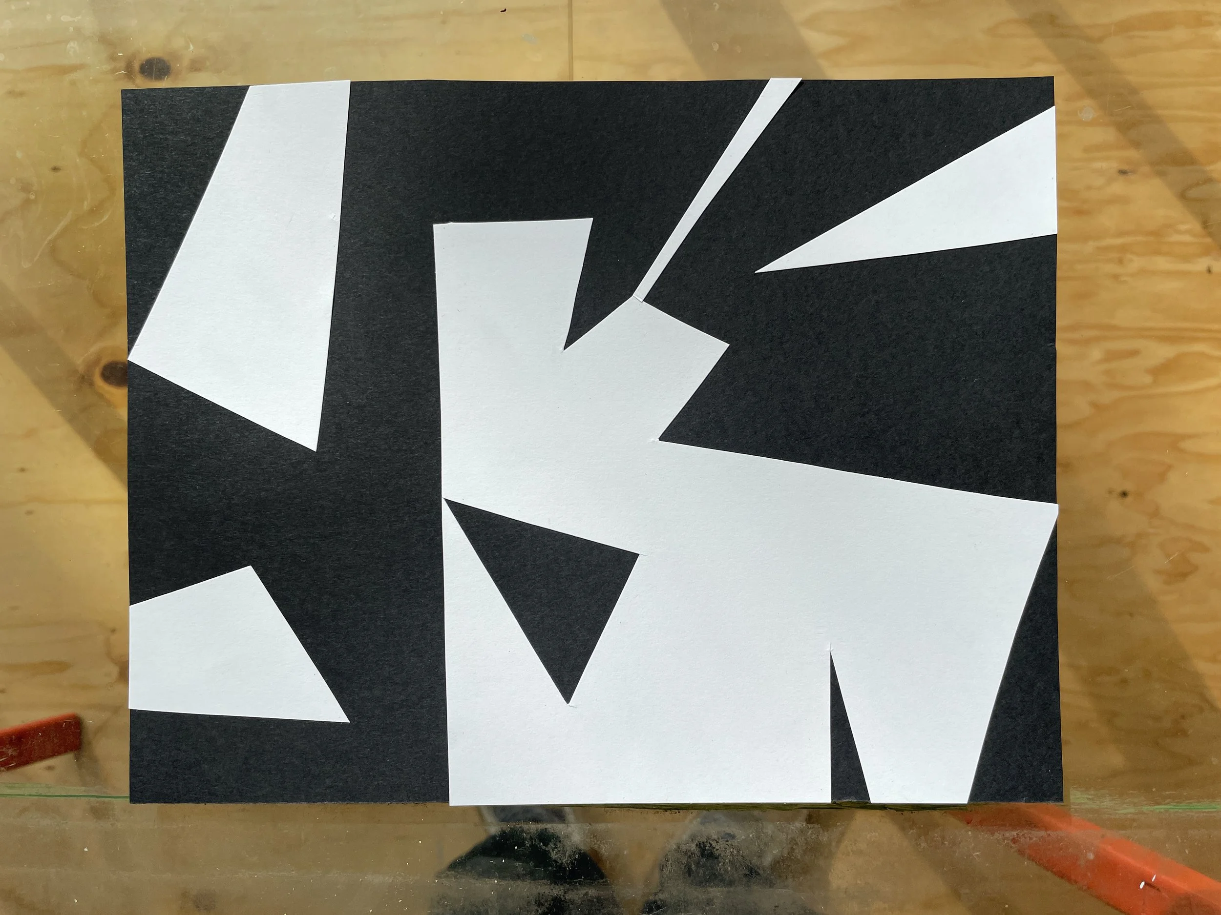
Inversion of black/white shapes.
4. Repeat this exercise as many times as you like, each time deepening your awareness of the positive nature of ALL shapes within your rectangle.
5. Complete at least one collaged set of your favorite composition and it’s inverse. Carefully glue-down the parts, paying attention to your craftsmanship. You may need to repeat several times to get a satisfying version.
Every shape in a painting is a “positive” shape. Each shape is equally important to the whole of a composition. They cannot exist without each other; they define each other.
This is a 45 minute video of me experimenting with shapes, for you to play in the background as you create your own. No audio except the sound of rain.
A video of gluing down the pieces. No audio.
Take it Further:
Try it observationally. Work from your surroundings. Begin training your eye and interest towards shapes of light and dark in your environment, rather than only seeing tactile objects. Squint your eyes and let the darks cluster together in a large arabesque. Look at dance of lights at an angle. Stage it if necessary and/or desired. Photograph it, play with format until you like the shapes. Compose.
Use Your Technology:
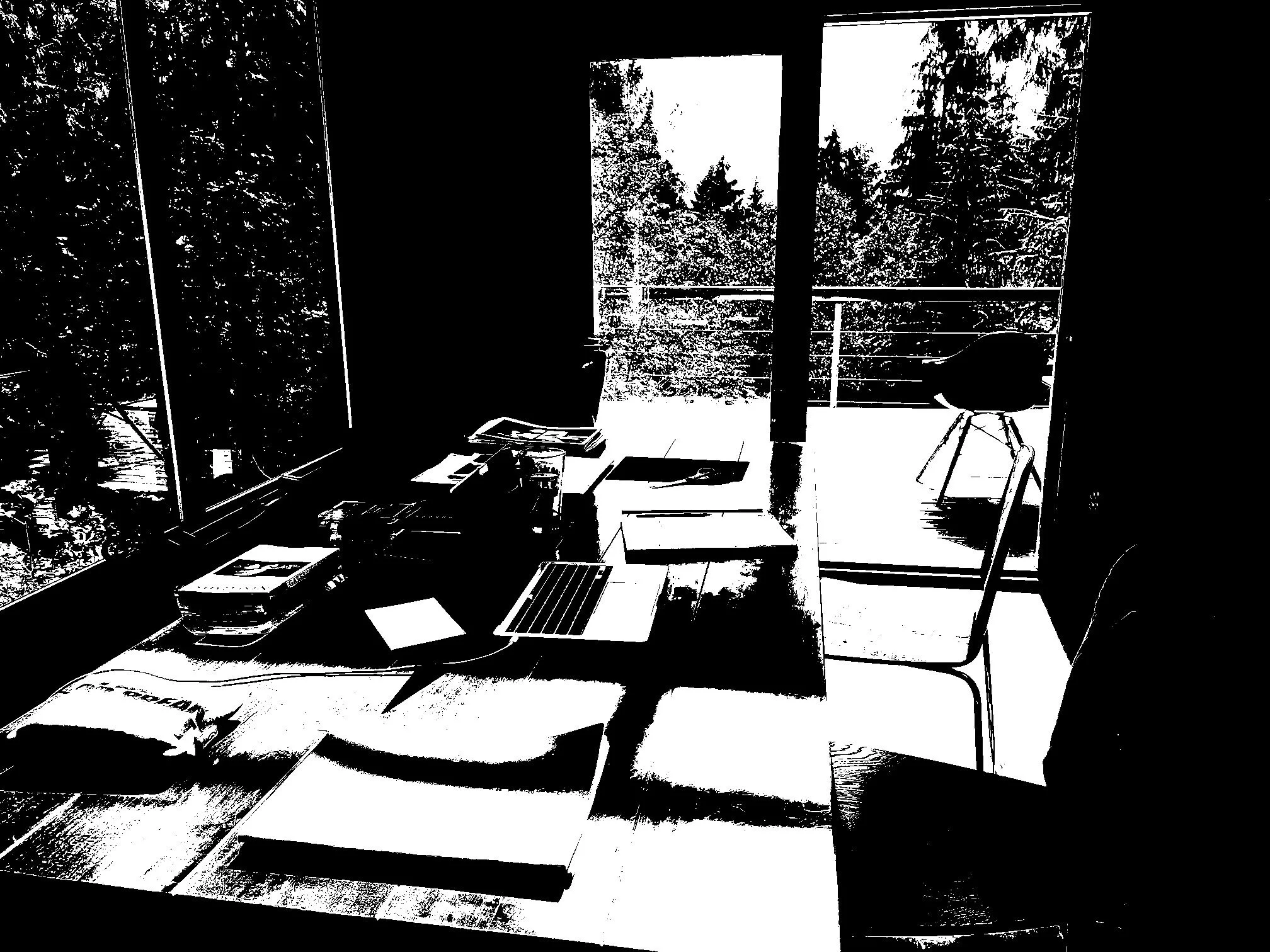
It is very useful to desaturate and posterize your images to help train you to see the strong, graphic bones of an image. There are many apps on your phone (I use “see value”), as well as photoshop, to do this. Do some research.
While using this technology is a quick, useful tool, it is not necessary. You can train your eye to cluster and navigate the the shapes of light and dark through focused looking, drawing and experimenting.
Interior:
Interior: Color Photograph
Interior: BW Posterized 2-Value
2-Value Collage
Still Life:


Video of creating a 2-value collage of a posterized still-life. No audio.
2-Value Collage.
If you are feeling unable to find a compelling composition, you can use old photographs or reproductions of paintings that catch your eye.
Even Further Explorations:
Bring this vocabulary into your sketchbook. Draw and measure-out your shapes; smear, gesture and erase-out your shapes. Experiment.
Try your water media/ gouache: create delicious little painted studies of the poetic geometry of multiple images.
GOALS:
Awareness of the foundational shapes that create our images. Playfulness and delight in creating the structural bones of our images. A meaningful experience of the Beginner’s Mind. Creating compositional form.


LESSON 2: Entering the Theater
Assembling Your Characters and Directing a Scene.
Composing a Picture Built with Discreet Shapes.
Learning to translate what you see into a limited number of distinct shapes will be an asset to you as we move towards the color-blocking method.
PART 1: Who are your Characters?
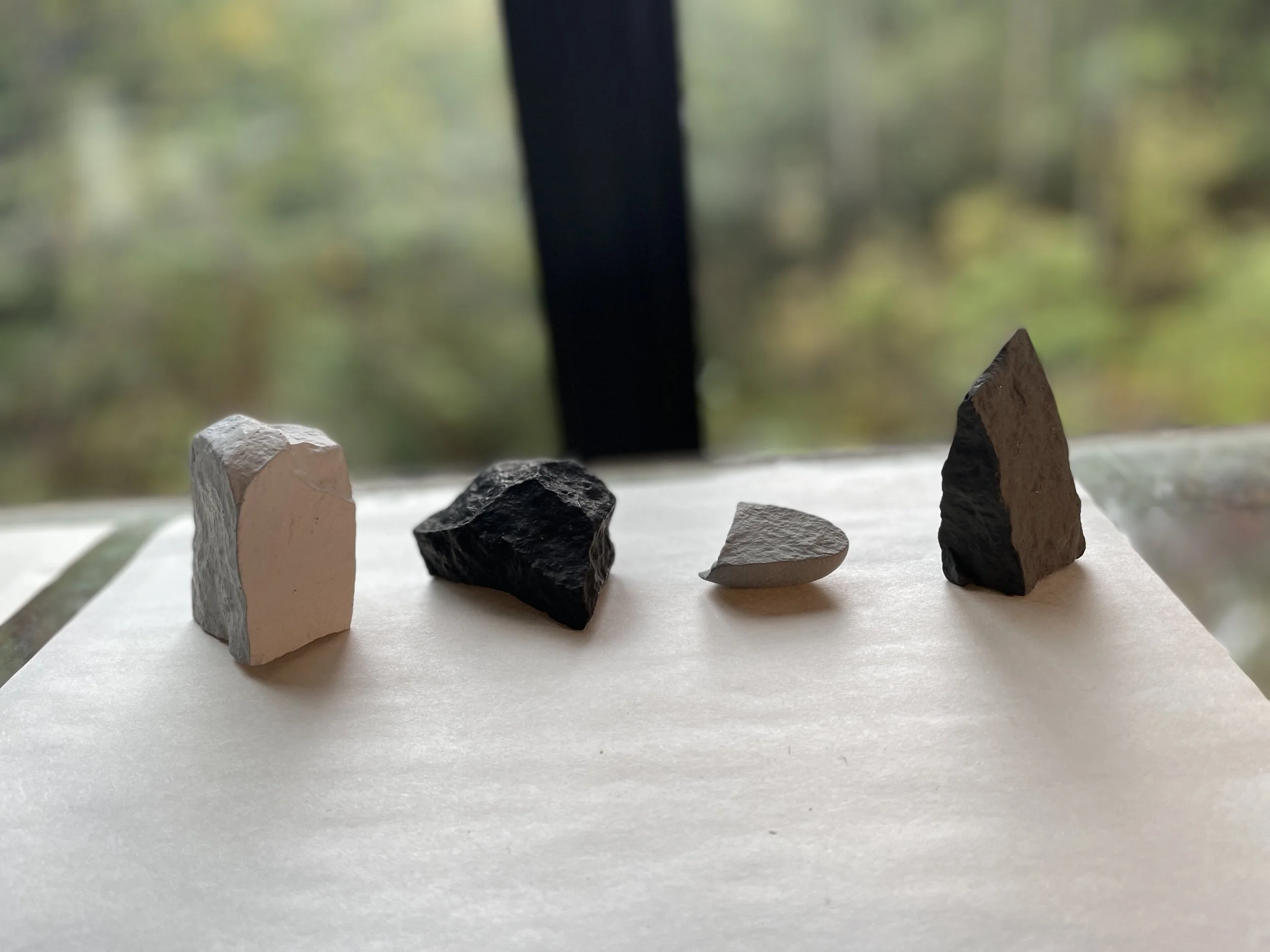
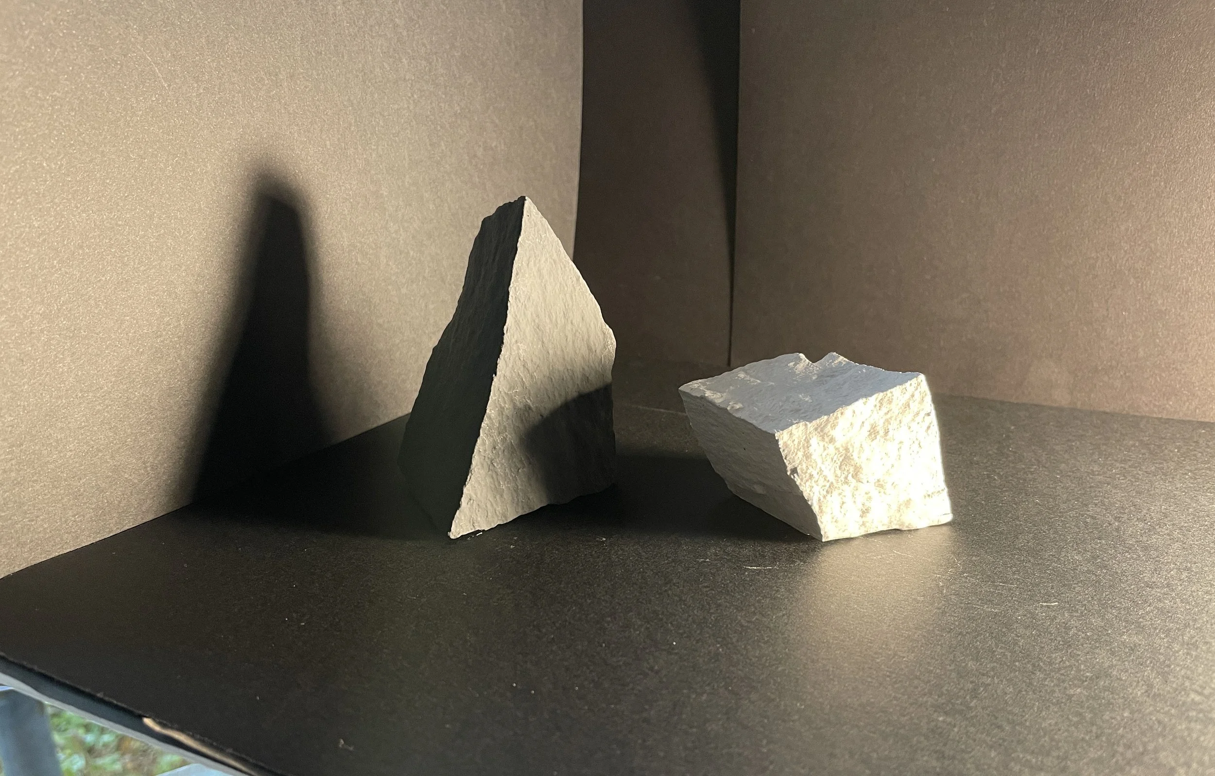
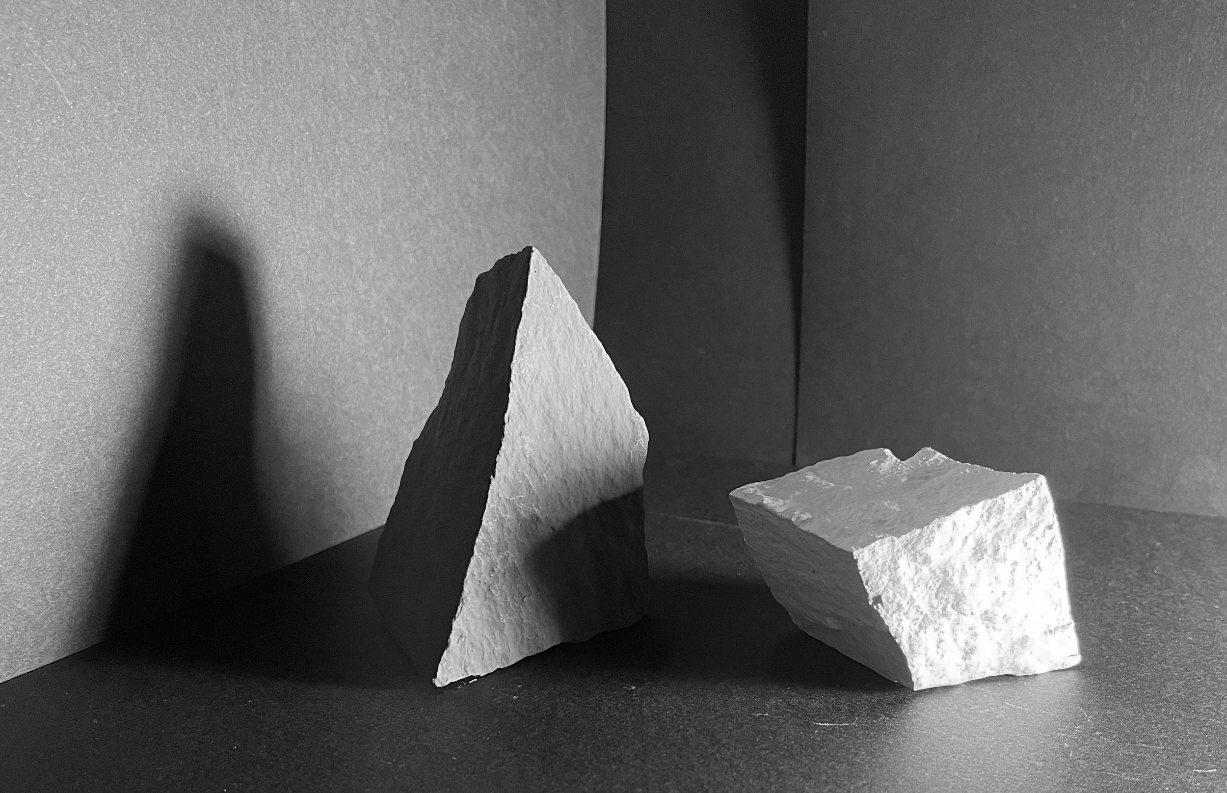
Found rocks painted with gouache.
Chunks of plaster.
There are certain characteristics I want you to look for when assembling your cast:
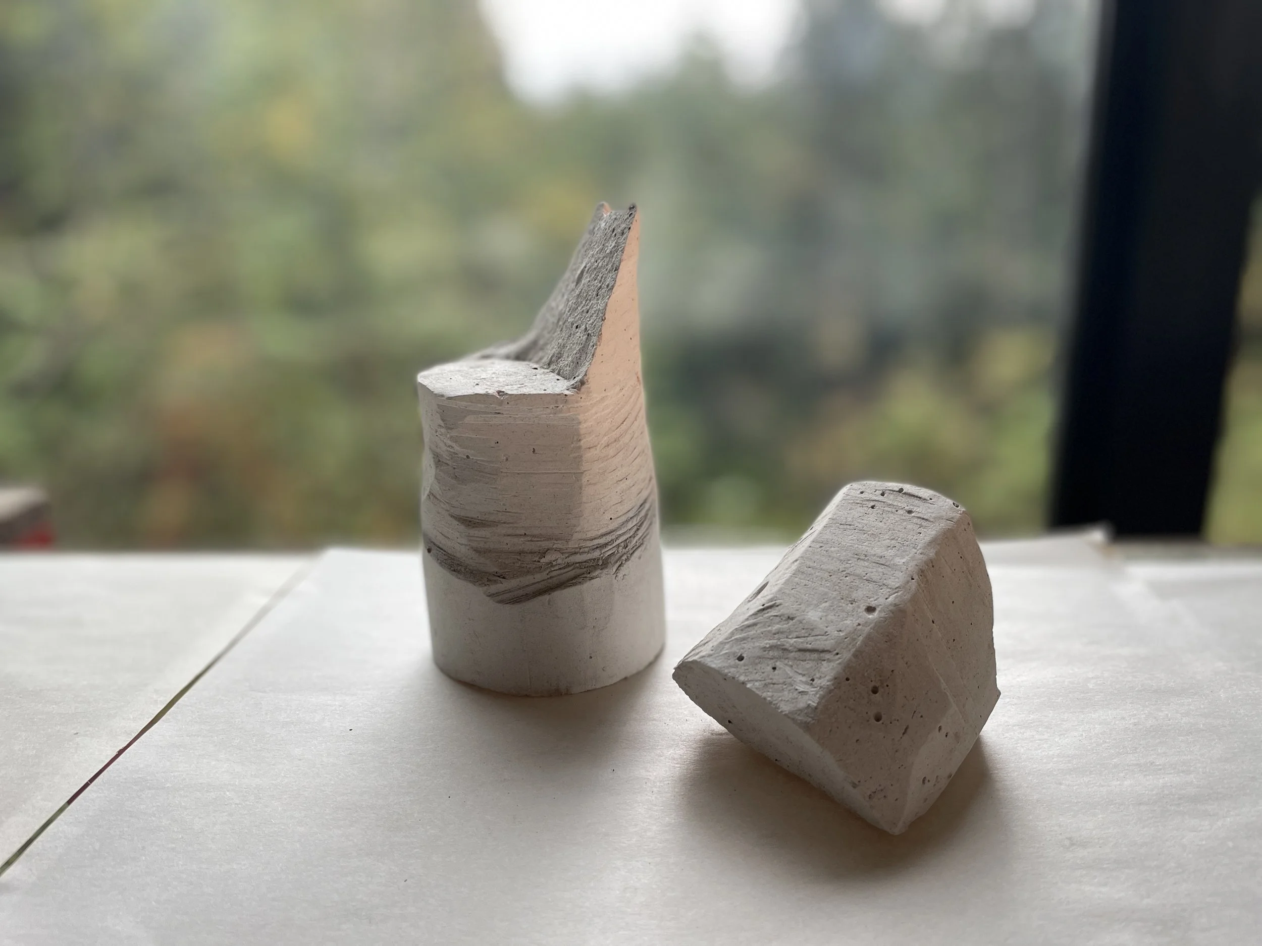
-Three-dimensional, planar, geometric forms are best. Rocks. Wood blocks. Chunks of Plaster. Found Objects. Make your own: splice and form them out of cardboard; hammer a hunk of concrete into shards; cast simple forms with air-dry clay; cut and bend aluminum or other metals, etc.
-Unnameable forms are best. Not “jar”, “vase”, “apple”, etc. Not objects we are already familiar with and have certain ideas about. Just elegant, simple, unique forms that have personalities all on their own.
-Not too large and not too small. You should be able to pick-up these forms and move them around. Not small and finicky (they need enough surface area to clearly pick up light and shadow) and not too large that you cannot easily place them in a still life theater.
-Variation in size, shape, and “personality” is important.
-Contrasting Values is important. I paint my forms with gouache or matte acrylic. Some dark, light, and middle value.
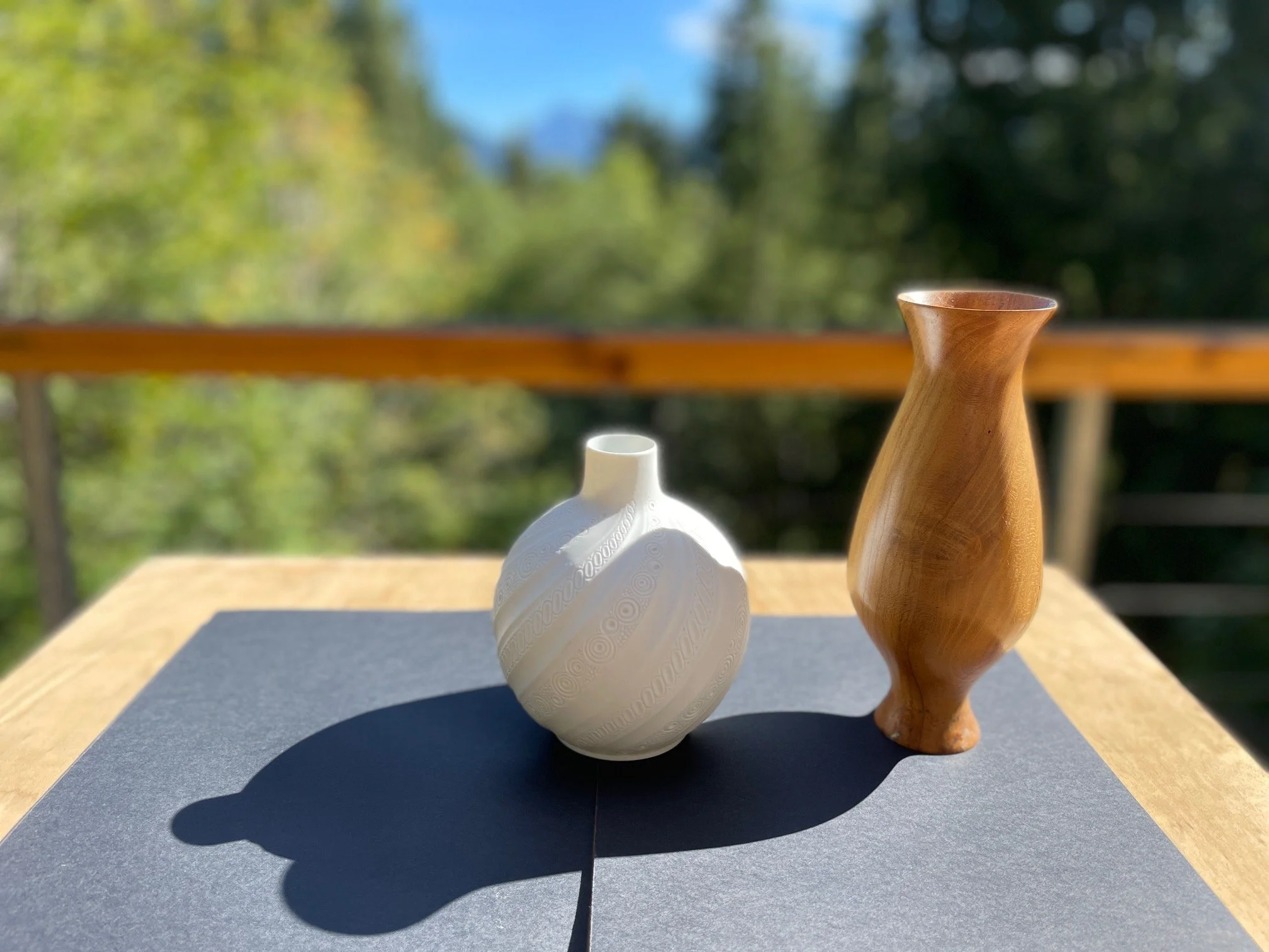
For this exercise I want you to select two forms: one darker object and one lighter object to interact in your theater.
PART 2: Setting the Scene
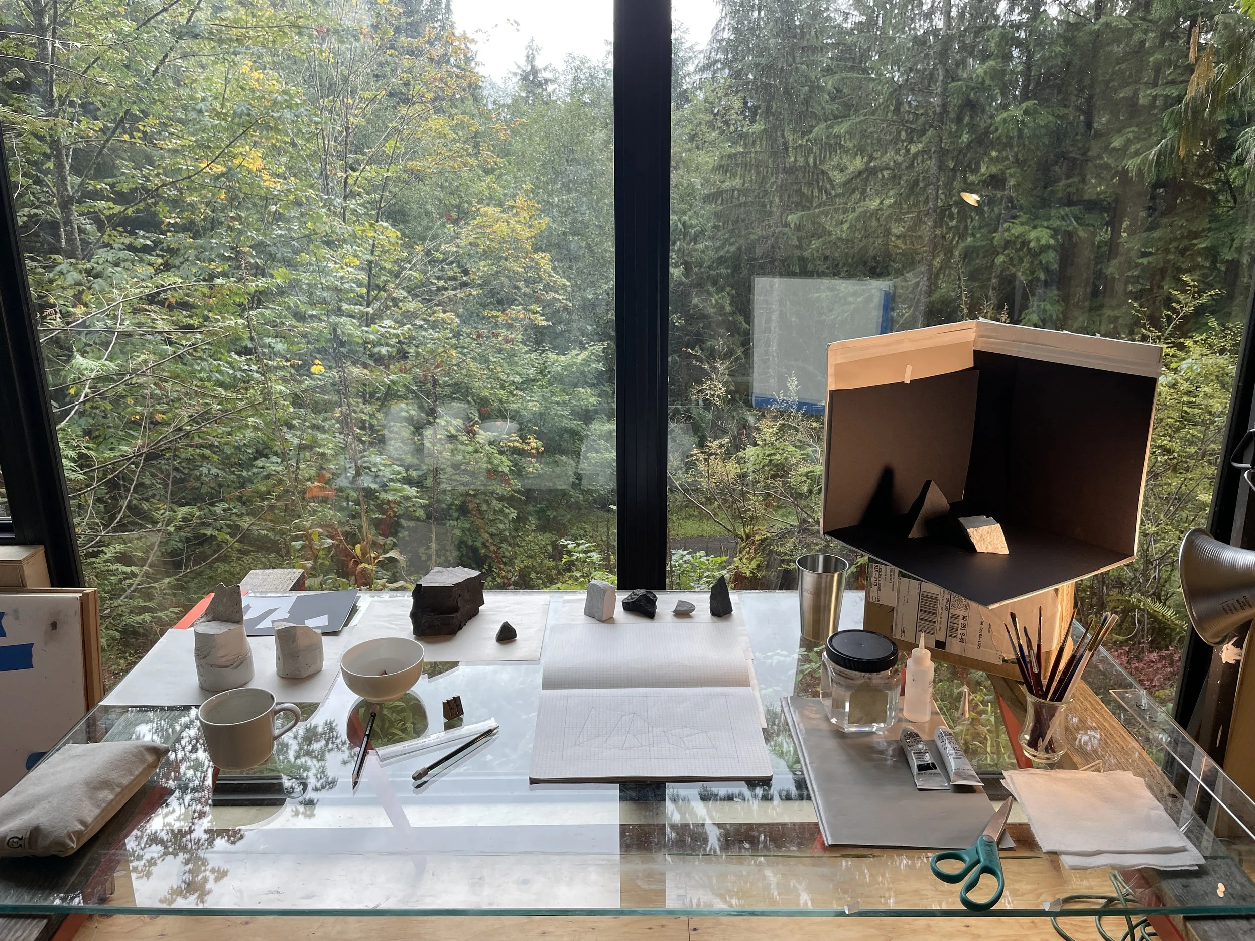
The Space:
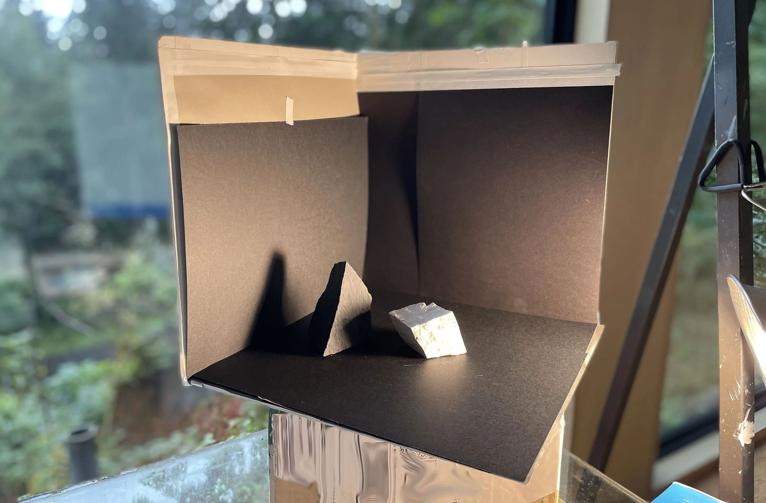
Your two forms can sit inside of a simple still life box, made of 2 walls and a floor. Or, if you prefer, your objects can sit out in the open. Either way, you want to make sure the ground and the immediate space surrounding your objects are made of simple statements of dark, light, or middle value. I use sheets of black, gray, and white paper to line my floor and walls.
In my example here, I lined all surfaces with black paper.
The Light:
It is crucial that you have a portable light source that you can move around and manipulate. I use a simple, inexpensive clamp light from the hardware store. I use an energy efficient LED bulb, not too cold, not too hot. Warm is perfect.
For this exercise I want you to set up your light on one side of your objects, nice and low, so that it creates a dramatic cast shadows.
The Scene:
Experiment with your characters, turn them around in the light in such a way that each object shows a clear, distinct shift in values. Meaning, both objects show a clear light side and a clear shadow side. Orient them toward the light so that their planar forms are expressed dramatically.
Make one form cast a shadow upon the other form. Imagine this shadow as one form “touching” the other, a kind of bridge that unites them. Create an overall pattern like this: form/ shadow/ form/ shadow. In my example, my final shadow climbs up the wall and becomes another character in the drama. Squint your eyes and look for compelling shapes of light and dark that both dissolve and announce the character-forms.
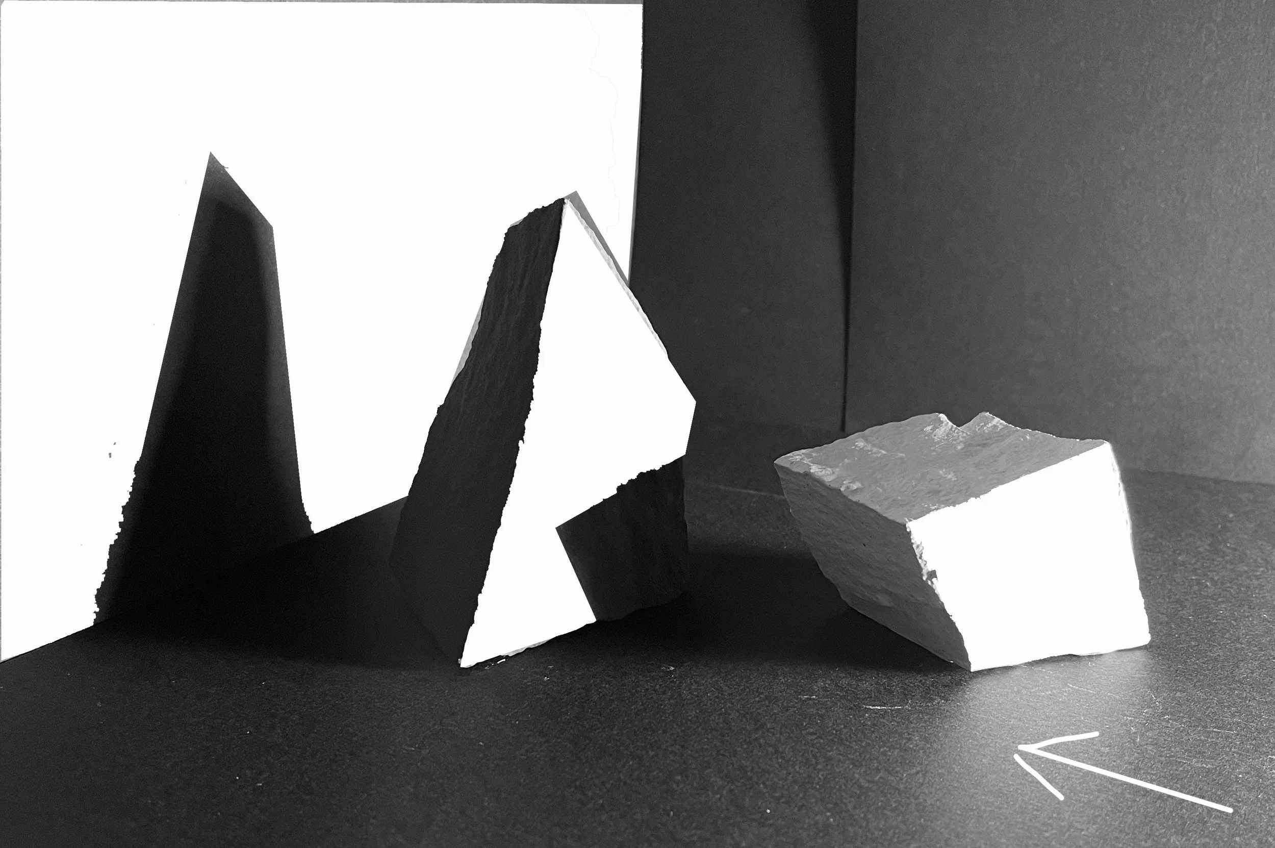
PART 3: The Drawing
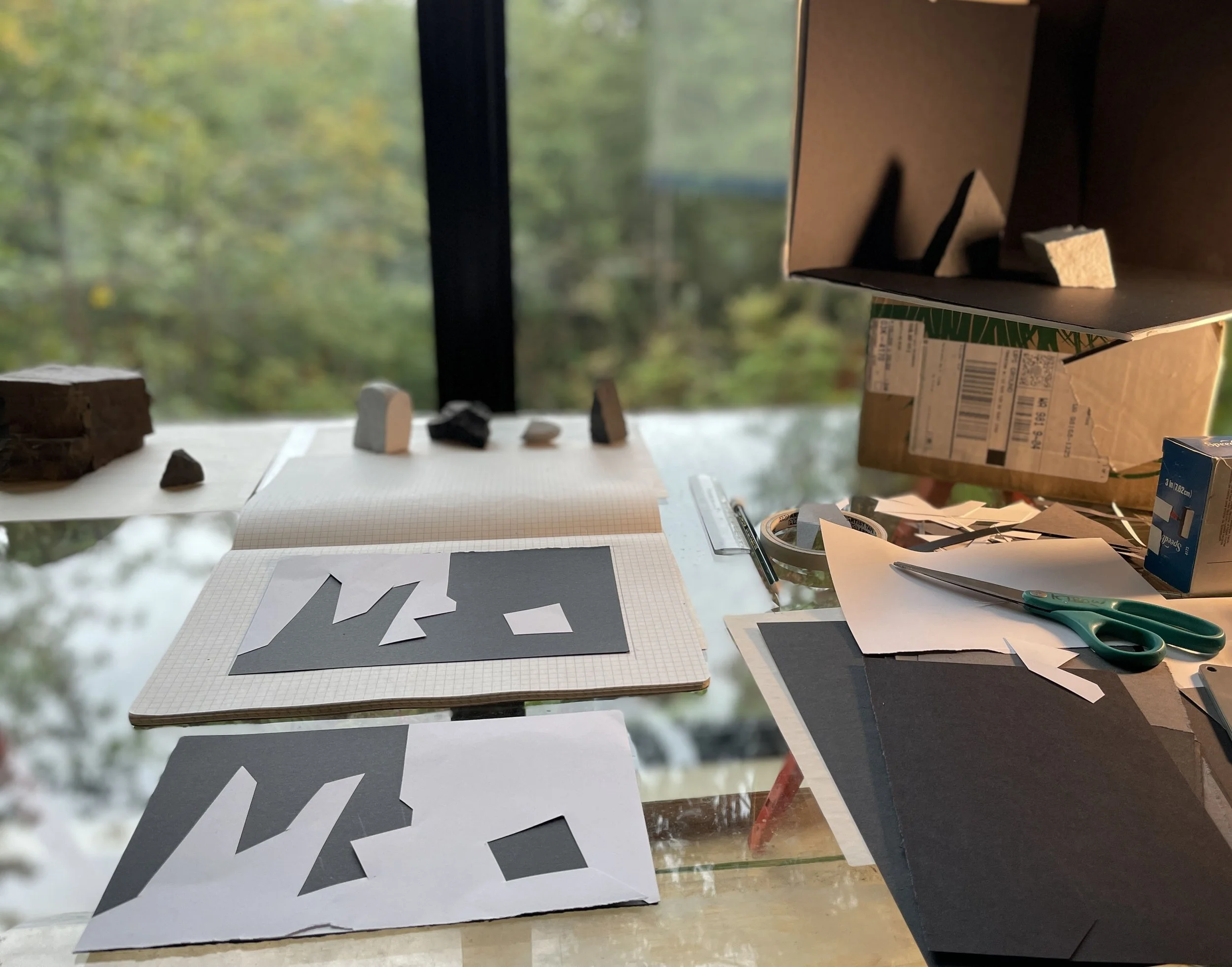
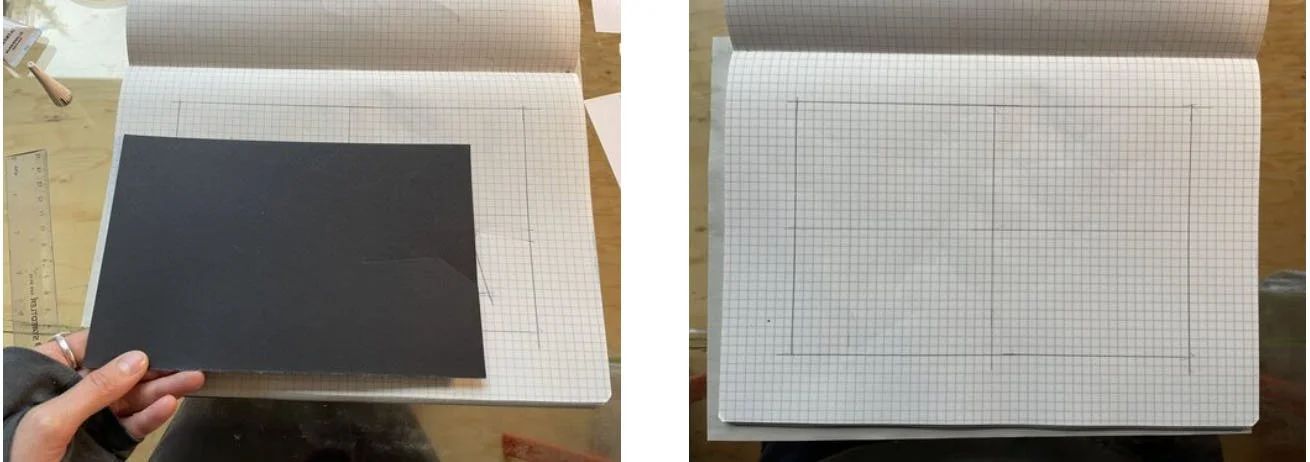
Because we will be collaging from this drawing, we want to make it a size that is easy to trace and cut-out.
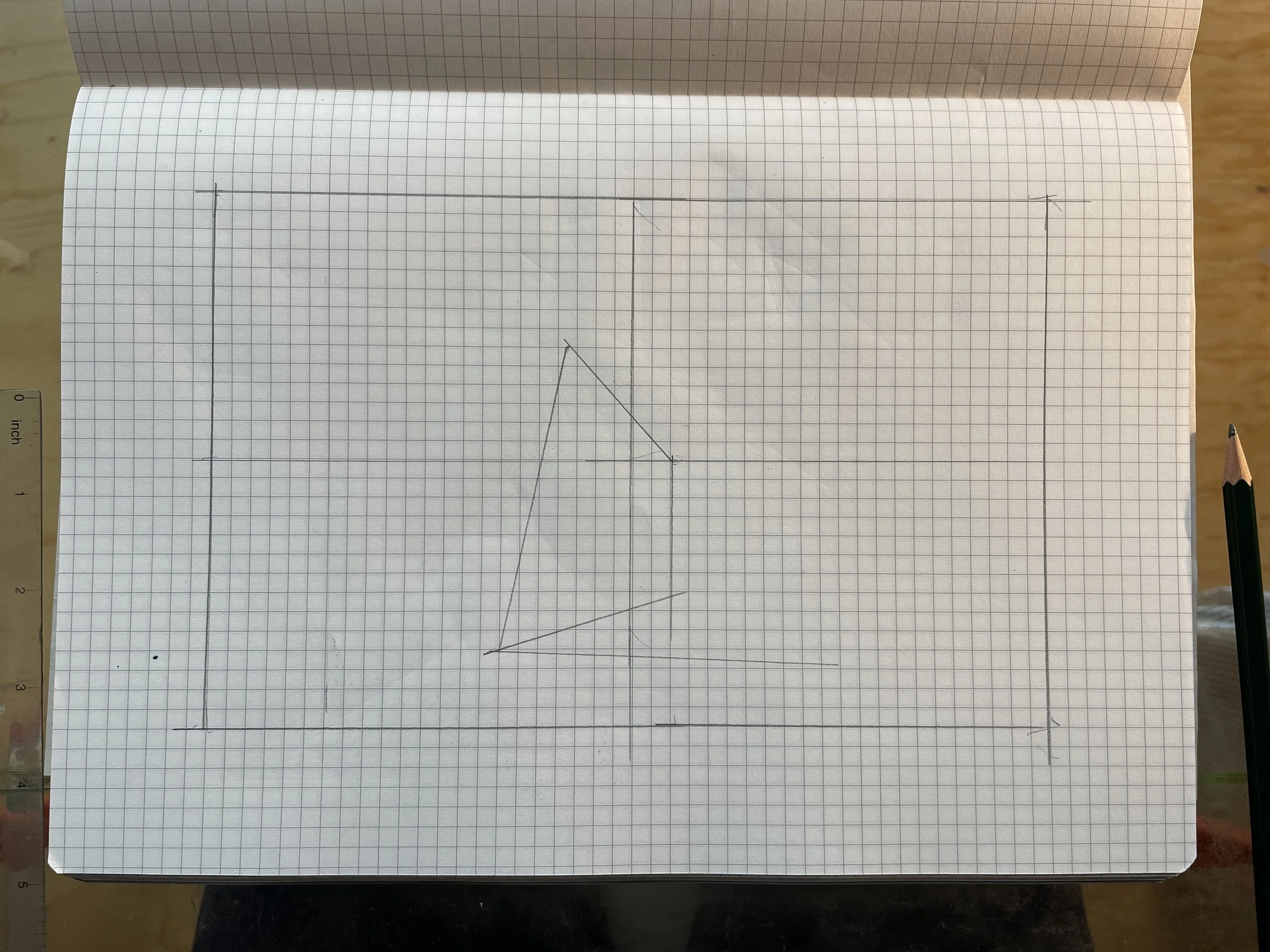
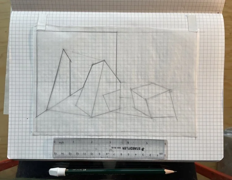
Fold a piece of your white or black paper in half and trace that rectangle into your sketchbook to be the shape of your composition.
Now, notate the horizontal and vertical mid-points of your rectangle.
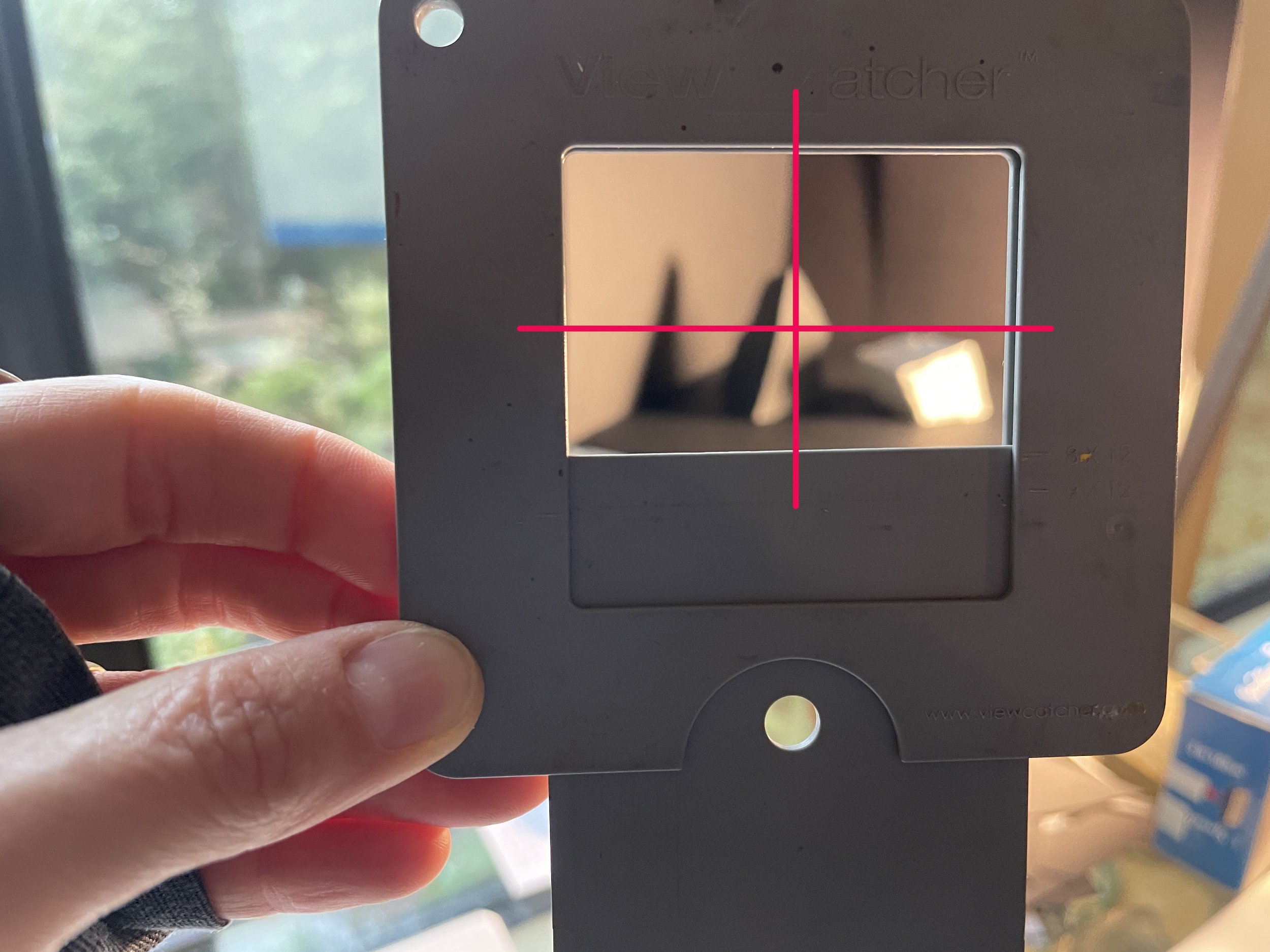
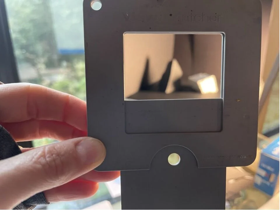
Looking at your theater of objects, crop-in far enough to fill your rectangle with your characters and their cast shadows. I like to use a viewfinder to do this. (The one shown here is called “view catcher,” which I have adjusted to mimic the horizontal shape of the rectangle on my page. You can also cut-out a rectangle from a pice of paper to peer through, or construct two “L” shapes out of cardboard to create your own viewfinder.)
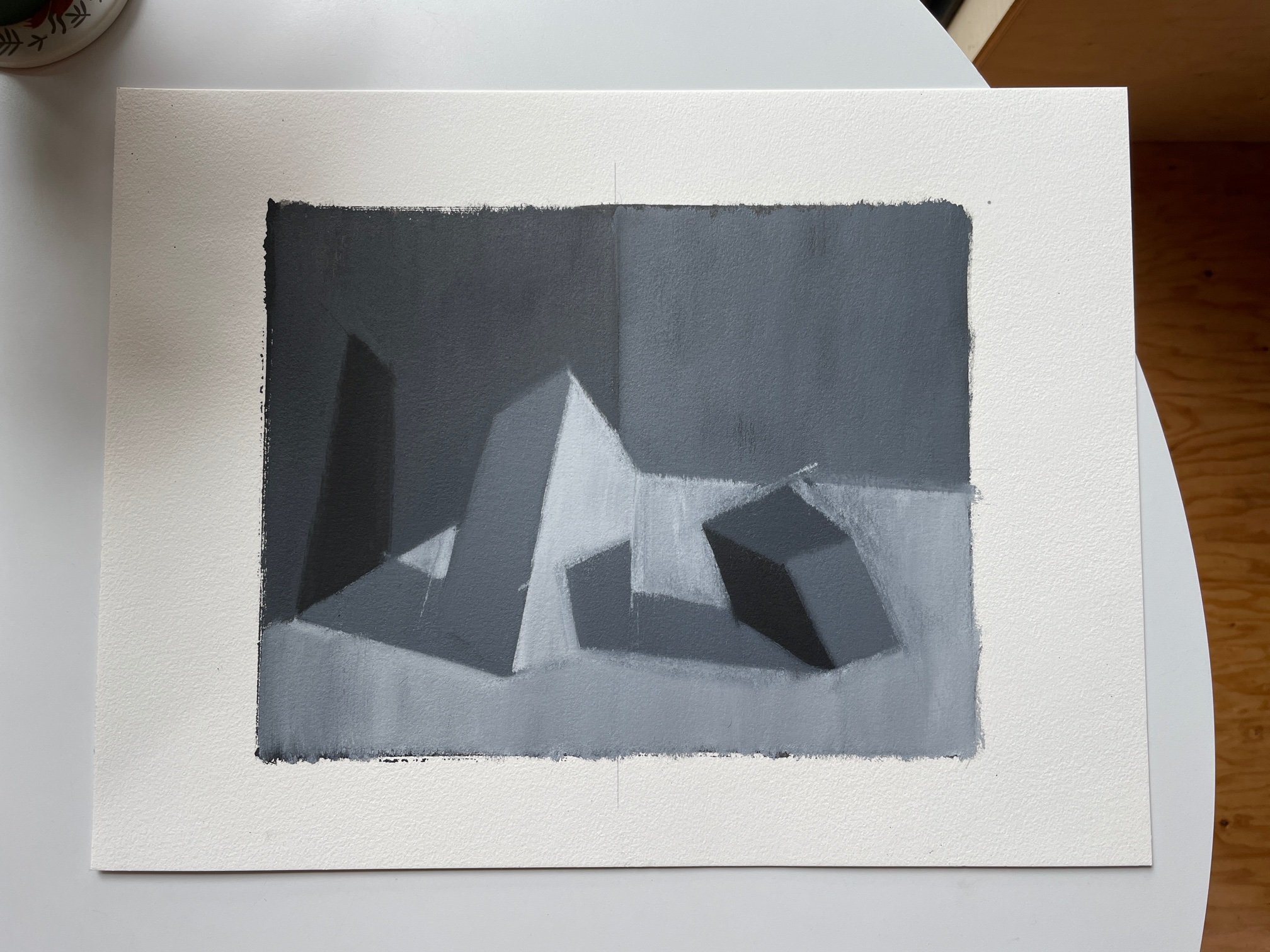
Identify the center lines of your view. These can be used as a visual “anchors” for setting-up your drawing. In my example, I am lining-up my vertical center line with the back corner of my still-life box. My horizontal center line intersects with the right-hand corner of my dark object, and also the top-most corner of my light object.
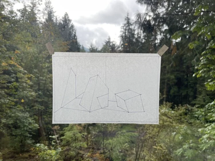
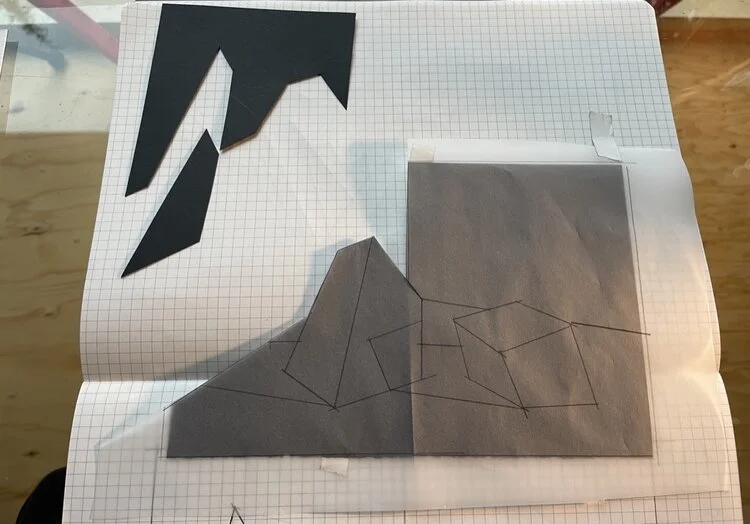
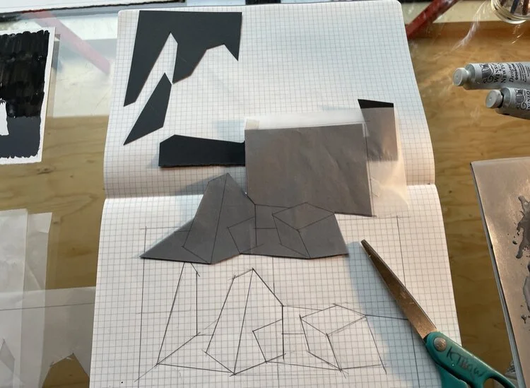
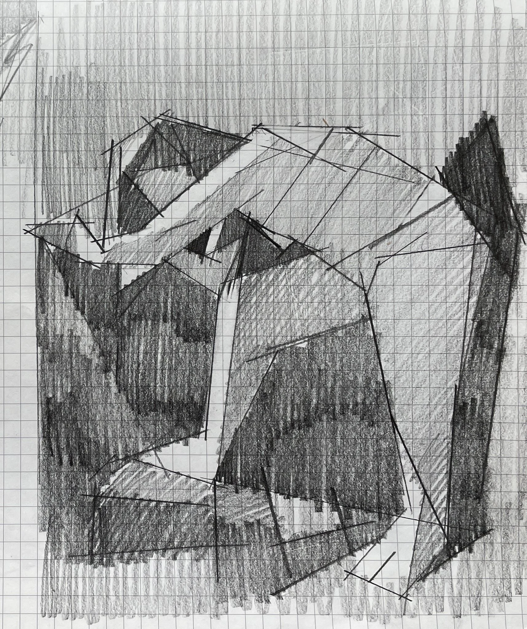
With simple, angled lines construct the dominant planes of your objects and the cast shadows they create. Your goal is to end up with a drawing made of distinct shapes that are easy to identify and can be cut-out with scissors!

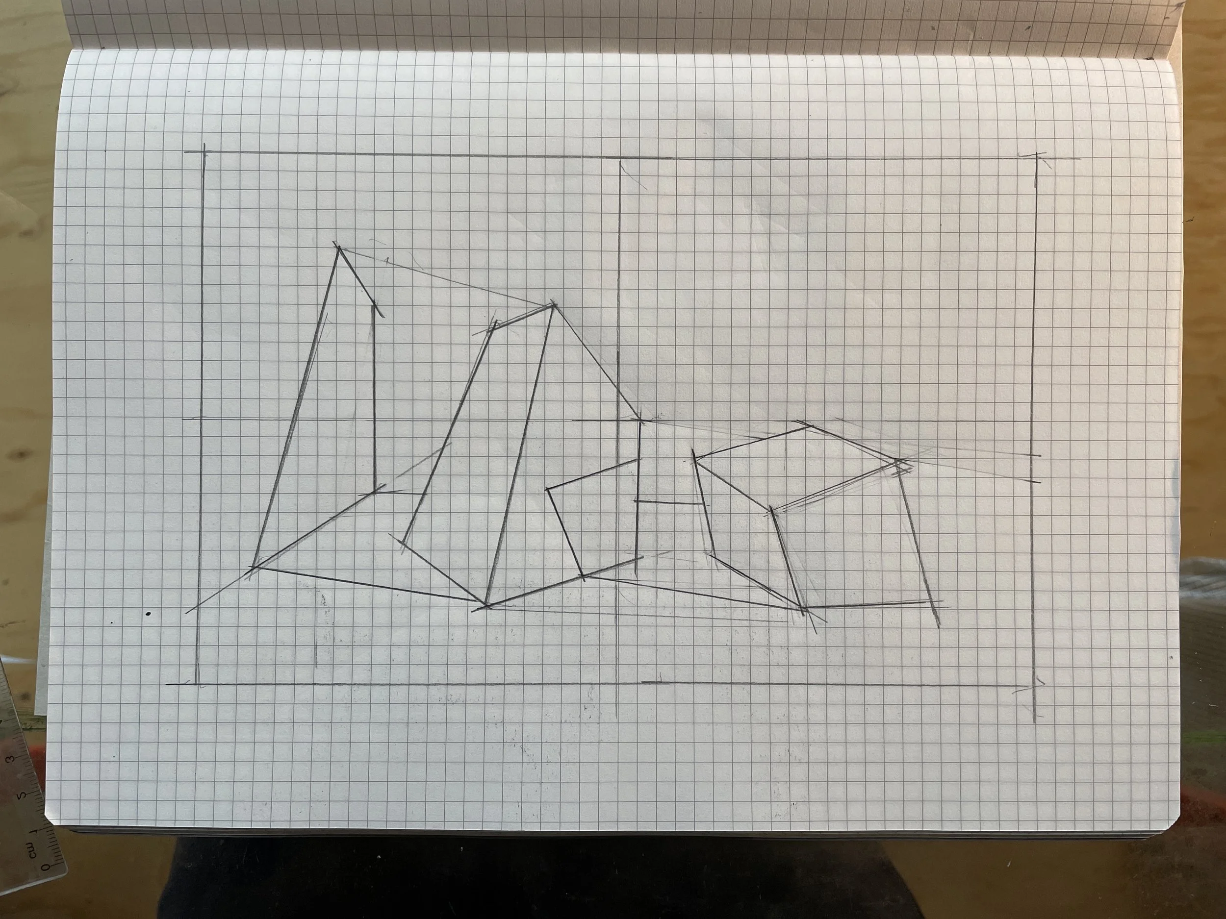
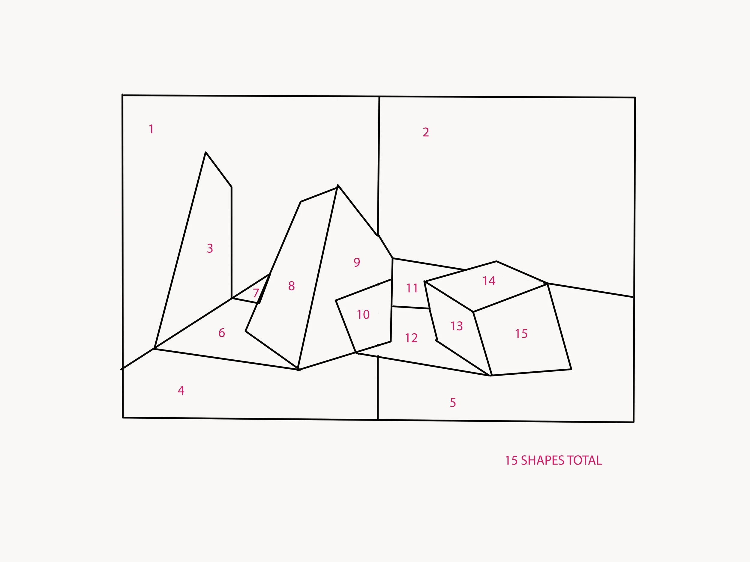
After working and re-working my drawing several times, I’ve landed on 15 discreet shapes that make up my composition. This drawing will be used to create multiple templates later on…
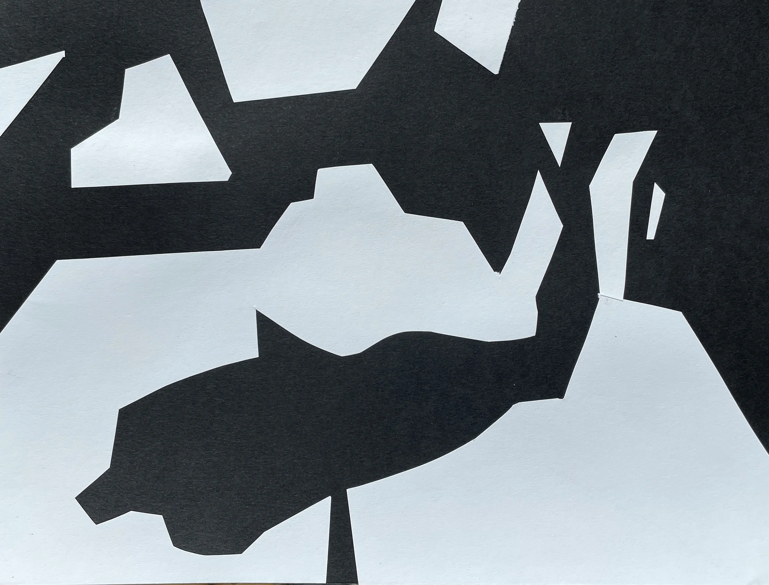
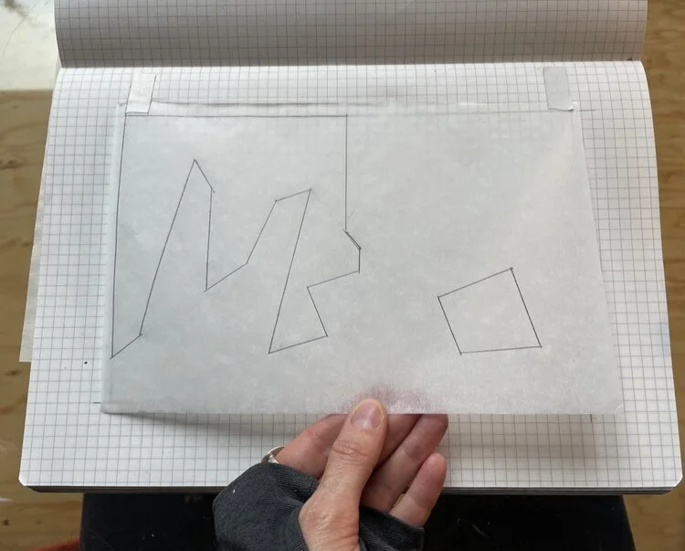
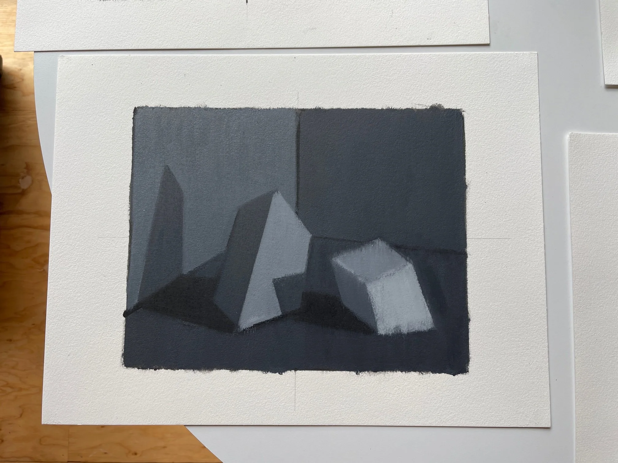
PART 3: The 2-Value Collage
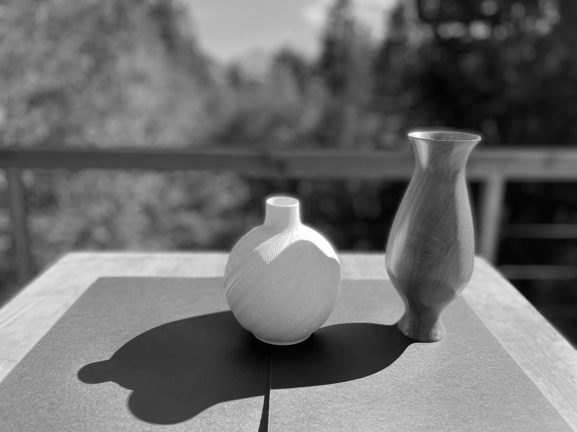
Now we are going to simplify our drawing into a 2-Value collage by grouping together our light and dark shapes. To do this, I squint my eyes and look for the main planes that are facing the direction of my light. You can use your posterization app to help you identify these shapes. Here is what I came up with:

Now, using tracing paper over your drawing, trace those combined shapes. In my example, notice how the light on the back wall combines with the light plane of my center object, creating one larger shape. Place this tracing paper over your half sheet of white or black paper and cut out your shapes, creating a 2-Value collage, and it’s inverted self.
These shape are the poetic bones of your scene.
You can experiment and create different versions, by combining your lights and darks in a slightly altered manner.

PART 4: Creating The Templates
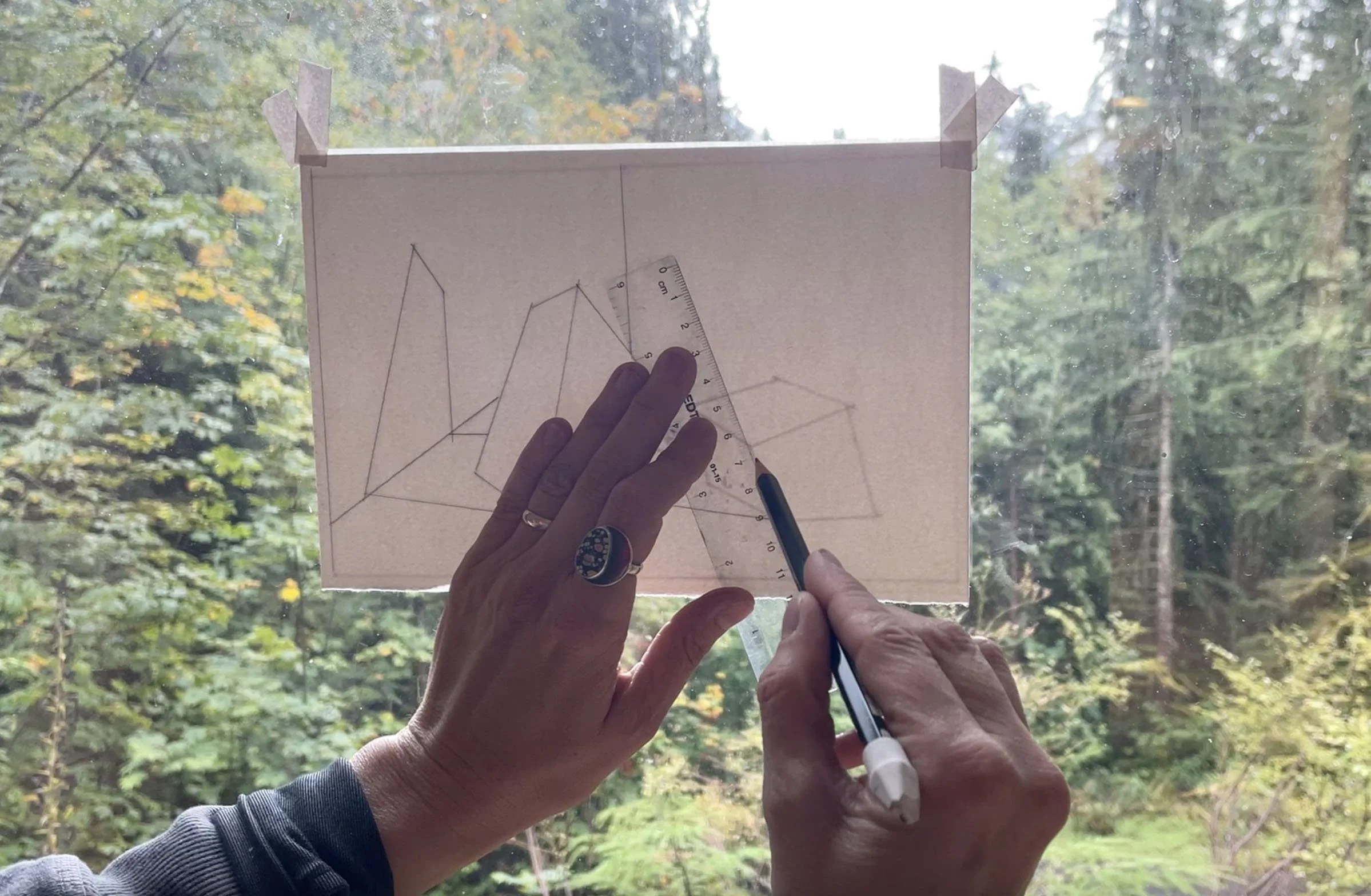
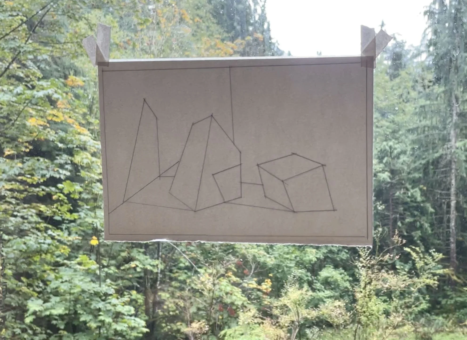
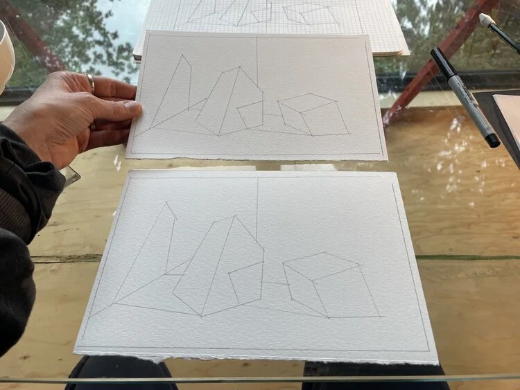
To prepare for our next lesson, we need to create several templates from our drawing of discreet puzzle pieces! To do this, I trace my drawing with distinct, dark lines and then tape the tracing paper to a window. (You can also use carbon or graphite paper to transfer your image. )
These templates will be used to make a series of gouache value paintings, so I am tracing the drawing onto watercolor paper. I’ve folded my paper in halves so they are the same size as my drawing. I tape the paper on top of the tracing paper, and trace-out a series of templates. You will want around 4-6 of these.
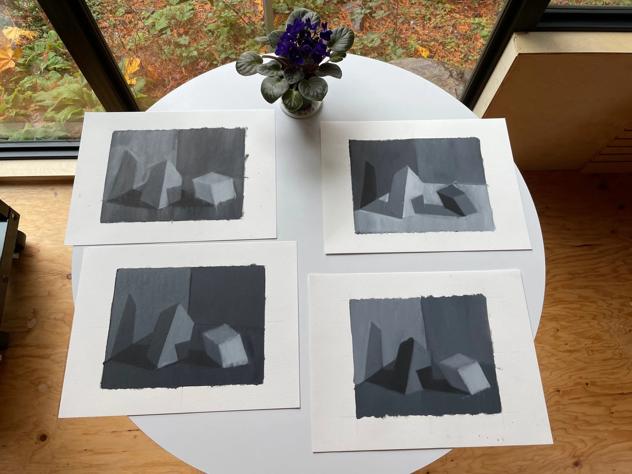
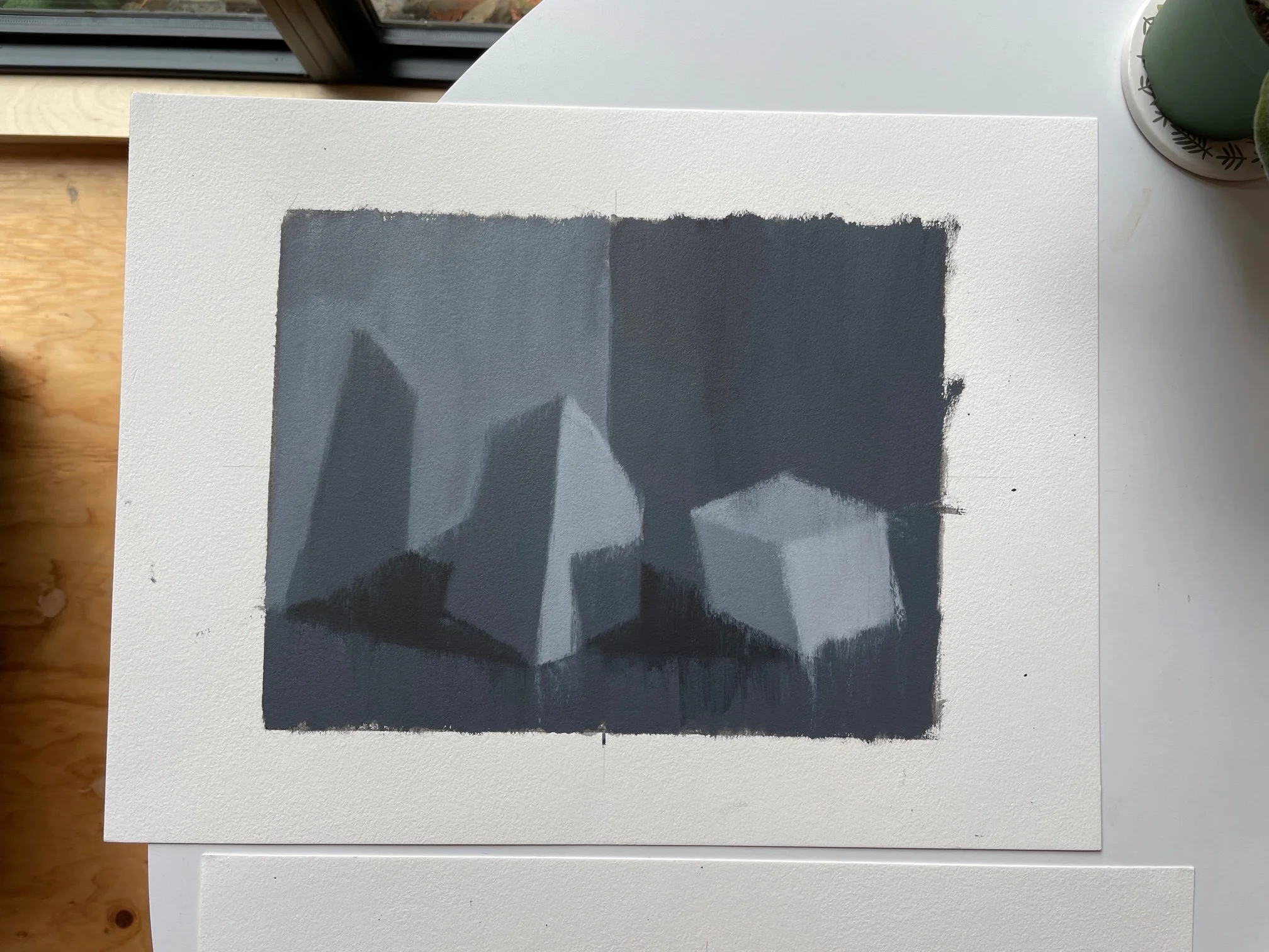
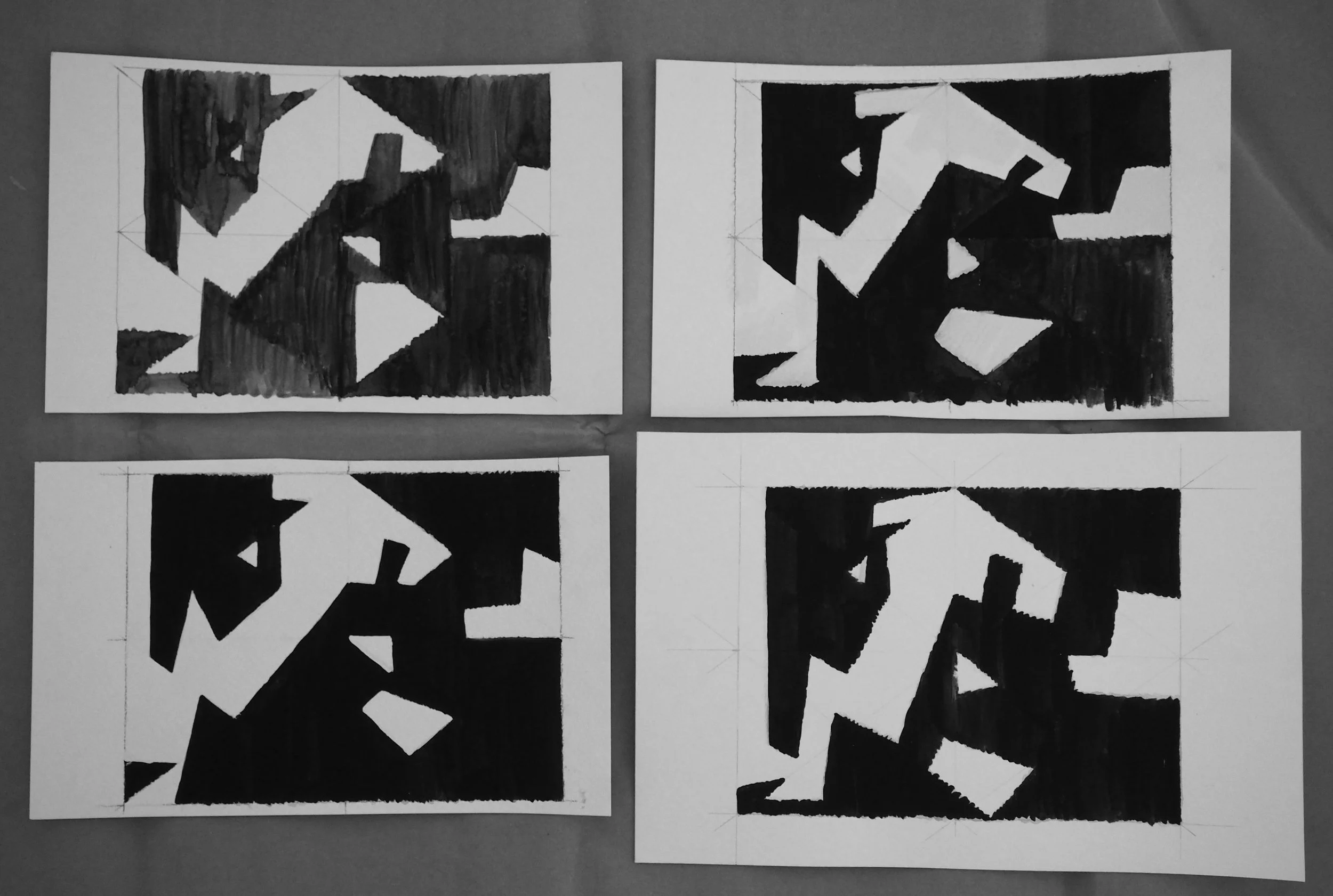
LESSON 3: Variations on a Theme of Three
Create a series of compositions using 3 values with gouache or other water media.
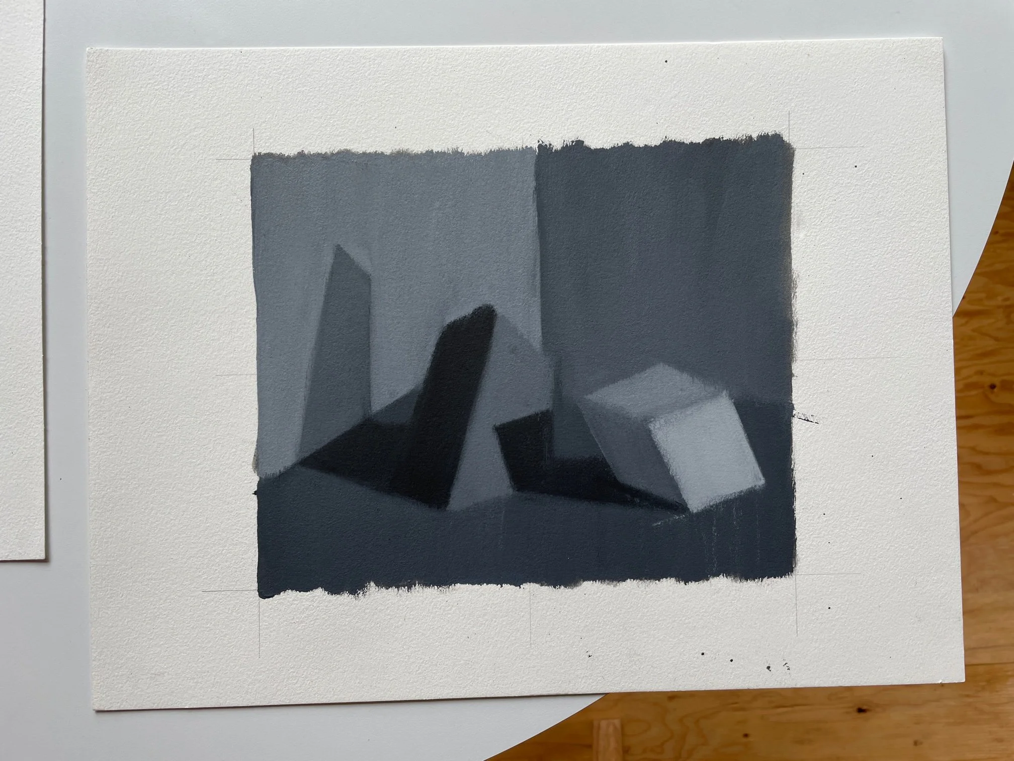
Now that you have your templates ready to go, we are going to play our compositional scales using a palette of only 3 values: black, white, and gray. The arrangement and re-arrangement of these three notes within your template will reveal new insights and revelations as the structure and emphasis shifts.
Using the limited number of shapes from your template, plus the limitation of only 3 values, create a series of painted studies that explore various “solutions” to your composition-puzzle.

For the most part, in my examples, I kept in mind the direction of the light and was faithful to that in my painted studies. Meaning, I kept the planes that are facing the light source as lighter values, and the planes turning away from the light, plus the cast shadows, as darker values. I tried to see how much variety I could get within these limitations.
Do as many painted studies as you like. Have fun with this. Then make some more that break a rule or two and see what happens!
This stage of building an image has profound implications and is deeply tied to the poetic meaning of the work. The shifting of these foundational parts is nothing short of visual alchemy that can re-articulate our perception.
3 Value Gouache Demo, Designer Gouache. No Audio.
3 Value Gouache Demo, Acrylic Gouache. No Audio.
Optional Extension: Hieroglyphics
Create another “keyboard” to play your compositional variations with collage. Cut out ALL of the shapes from your template in all 3 values. My template is made of 15 shapes, so I cut-out 15 black shapes, 15 white shapes, and 15 gray shapes. Now I can use these physical puzzle pieces to rearrange and recompose upon my template. I can also use these shapes to re-arrange an endless variety of compositions. These are the bones of this composition. Let them rattle!
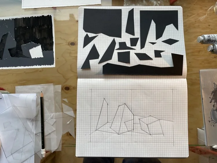
Using tracing paper, trace the outlines of your template. Place the tracing paper on top of the colored paper (taping in place if helpful) and cut-out each shape. Repeat for all 3 values: black, white, gray.
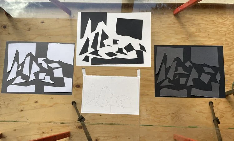
Now play around with different arrangements. I found I liked having this puzzle-piece game going-on parallel to making my gouache studies, as a way to experiment with variations before painting them.
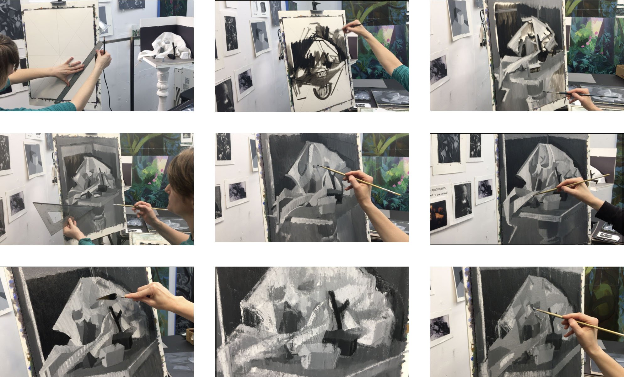
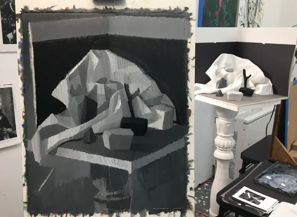
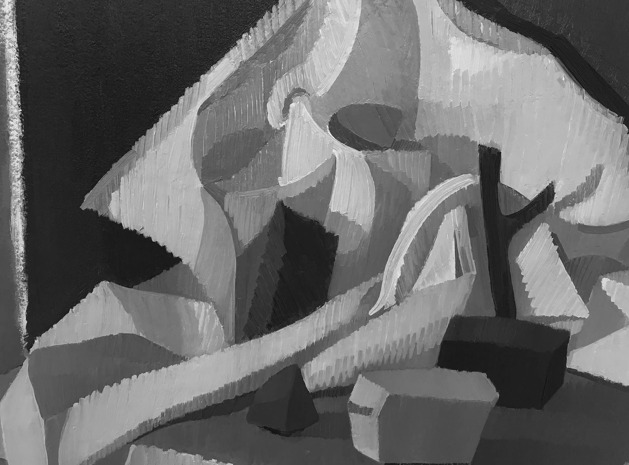
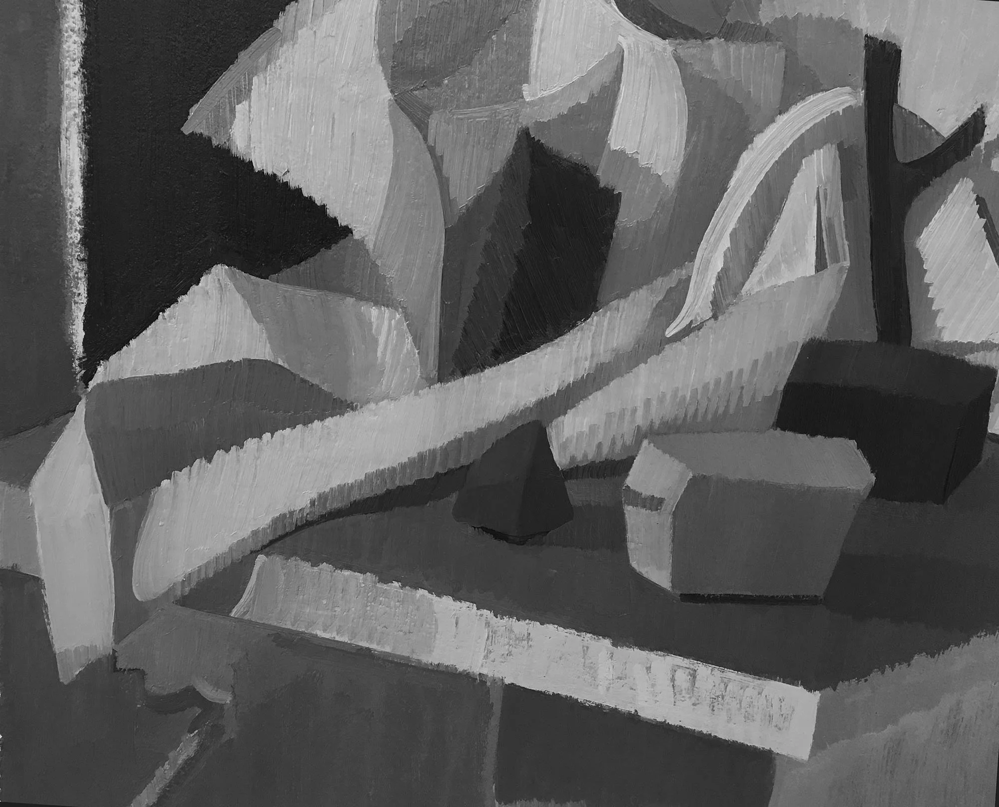
LESSON 4: Technical Narrative
Five-Value Block-In with Oil Paint
Create a minimum of 2 oil studies from your Template/ Rock Theater.
Leave at least one of the studies in the scraped-down stage. Develop the second one further by building the surface, refining the drawing, experimenting with and paying close attention to differences in your brushes and the viscosity of the paint.
The over-arching conceptual duality we are working with this term is the contrast between light and dark.
As we move-into painted oil studies, some profound technical dualities begin to appear:
-Type of Brush: Bristle or Smooth
-Amount of Medium, Oderless Mineral Spirits (OMS): Viscous or Thin
-Type of Action: Carving/ Caressing, Re-Structuring/ Filling-in a Shape, Drawing / Painting
“There are [different] kinds of narrative at work, at play in the artist’s mind when they’re making work. The first one is the dramatic narrative and that’s simply the subject matter, that’s basically what people call narrative art. The second one is the story of the evolution of the technique, and that is the technical narrative. It’s really the movement of the painter’s mind through the course of a picture, arriving at its terminus, and in the terminus the implication of everything that went into it is there, even though it’s not necessarily decipherable by everybody. ”
— Vincent Desiderio, from THESEUS
GOALS:
To slow down and be present to the needs of your painted surface. To get to know your tools and gain a sensual and sensitive relationship to the surface of your painting and your materials. To trust and follow what feels good materially. To not get caught in a finicky spiral of methods and habits that feel limiting and unpleasurable. To respond to feeling trapped by transitioning your means- switching brushes, changing viscosity, altering your attitude and stance.
You have to be a warrior of self-doubt in there. Always present, always adaptable.
Slashing and hacking and re-constructing when needed; Slowing-down, caressing and layering when needed.
You have to learn to tune and re-tune constantly in relationship to your surface.
A painting is a living, breathing entity asking for our full attention so that we can respond intuitively. Each painting is unique and requires individual considerations and presentness.
“The technical narrative should be the preeminent voice of the picture. That if you can merge what’s happening dramatically with the technical narrative, it’ll lead you to more places.”
— Vincent Desiderio, from THESEUS
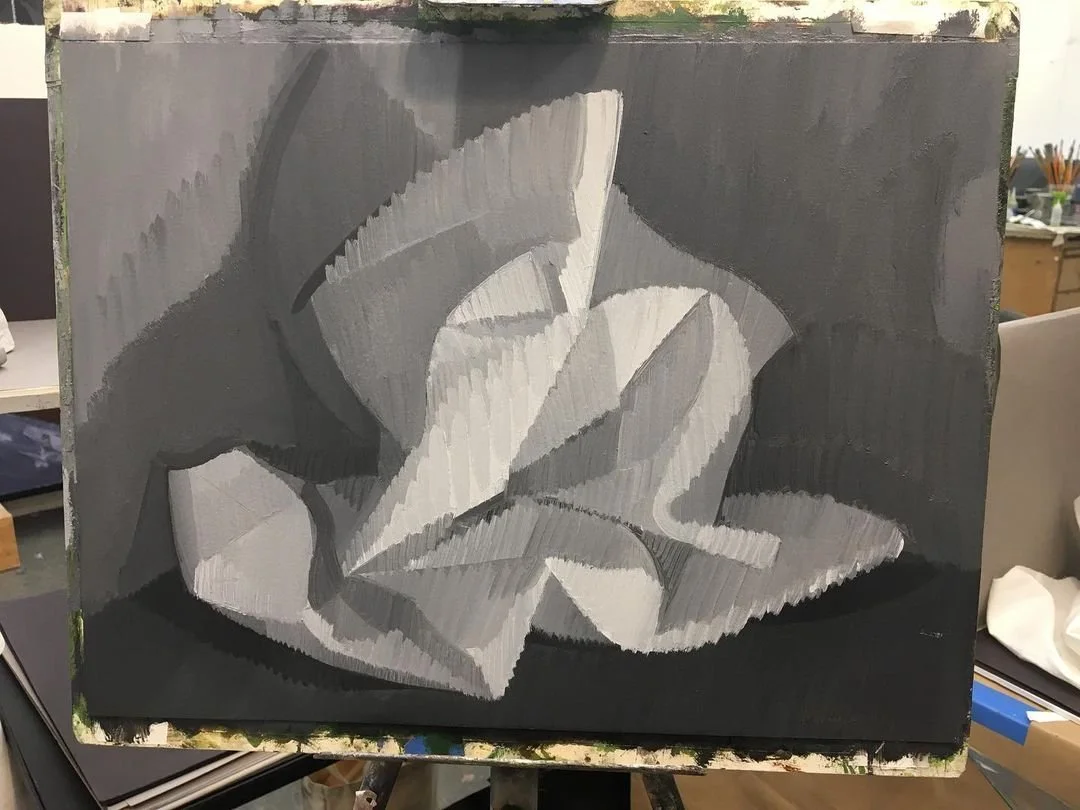
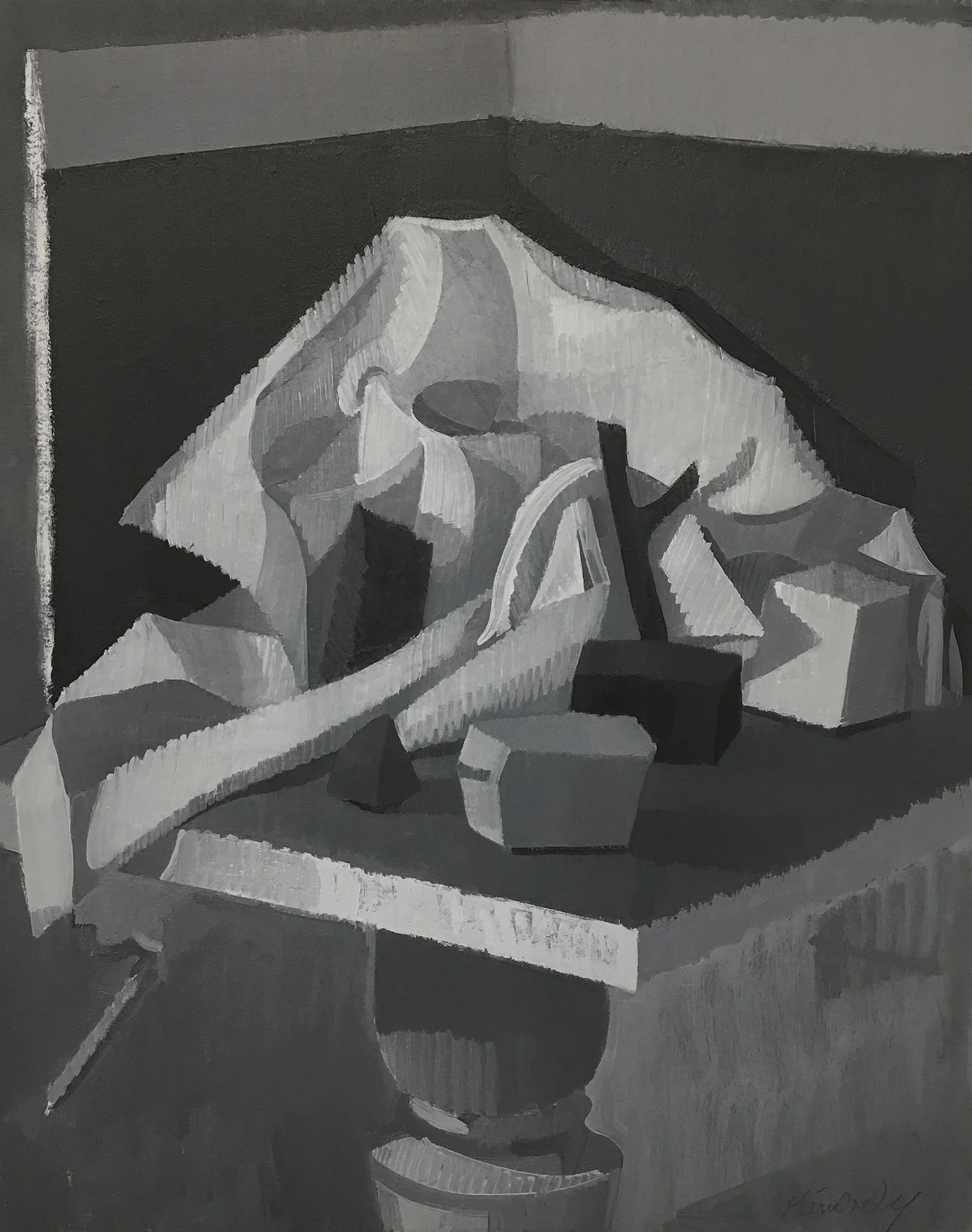
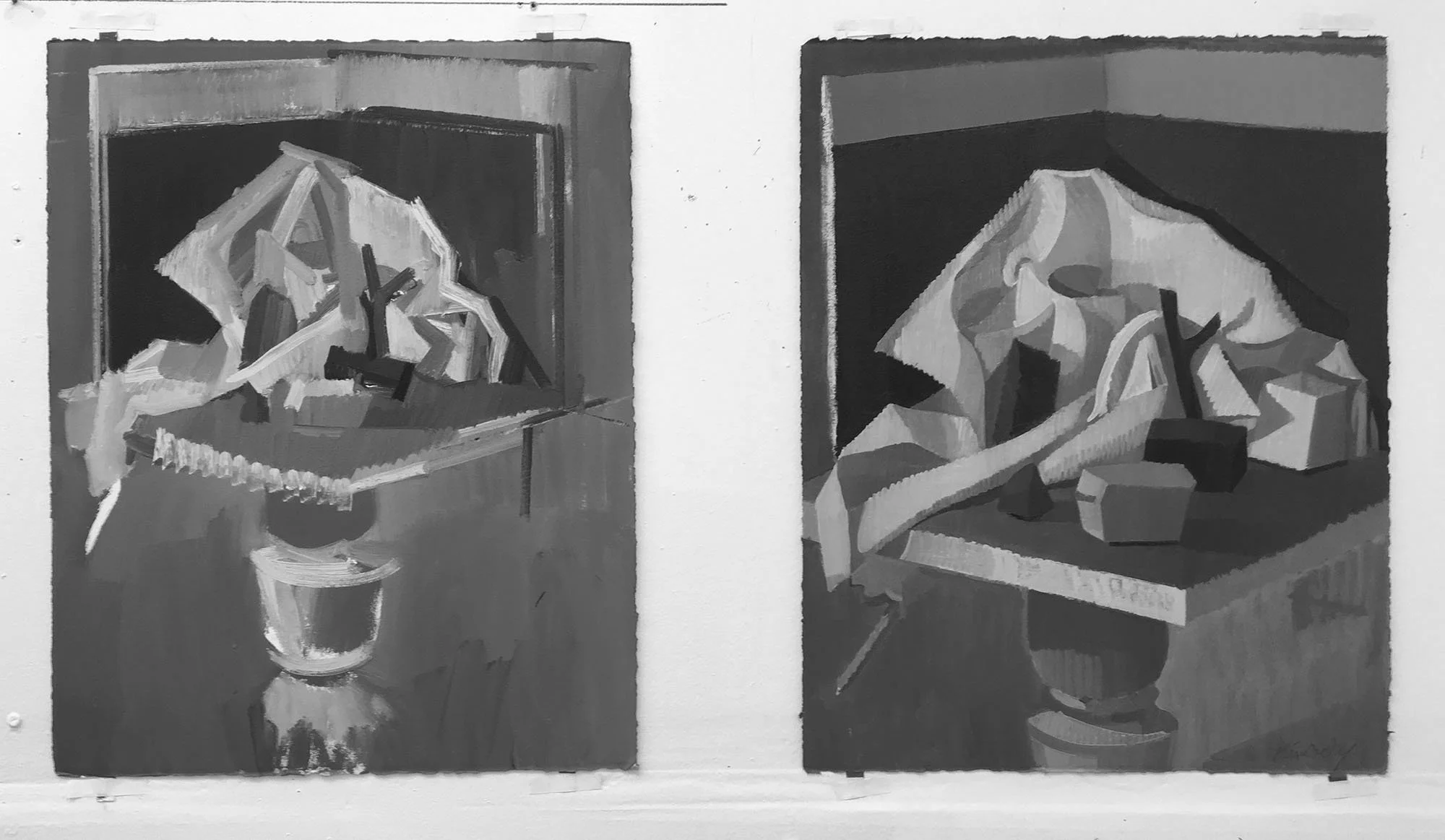
Step 1:
Create your Format. I simply traced a common 8.5” x 11” piece of paper to be my format. Make sure your format is LARGER than your original template. Using your Template as a guide, create an initial, linear gesture with thinned-out oil paint. Complete a first pass by blocking-in the darkest values, and then covering the rest of your surface with a transparent wash using a Bristle Brush and thinned paint with OMS.
Step 2:
Mix 5 distinct Values using Mars Black and Titanium White. Black can be your darkest value, but make your lightest value a subtle gray, not white out of the tube. Test them next to each other to make sure they are clearly distinct from each other. Adjust and re-calibrate as needed. Block-In opaque shapes of value, paying special attention to Relative Value Relationships. Using a bristle brush, “scumble,” or push, the paint across the surface.
Keep in Mind:
Relative Value: Each object has its own inherent value scale, relative to its local hue.
The white box has an overall lighter value-scale (1-3); the darker box has an overall darker value-scale (3-5).
After the initial, opaque block-in, lightly scrape-down of the surface with a palette knife to remove any surface texture and to prepare for the next stage. Letting the painting sit for an hour or two before scraping-down can be advantageous, as it lets the paint “set” a bit.
Step 3:
Returning to the scraped-down surface, you can now refine your drawing and build-up the surface of the painting as you see fit. You can scrape-down and return as many times as you wish. Experiment with using both bristle and smooth brushes, as well as different thickness and thinness of paint.
Step 4:
Further refinement of drawing and building the surface and edge-quality. I ended up noticing the lighter object in my template had more “personality” than my painted version, so I did some pretty major re-structuring. Continue to experiment with both bristle and smooth brushes, as well as paint viscosity.
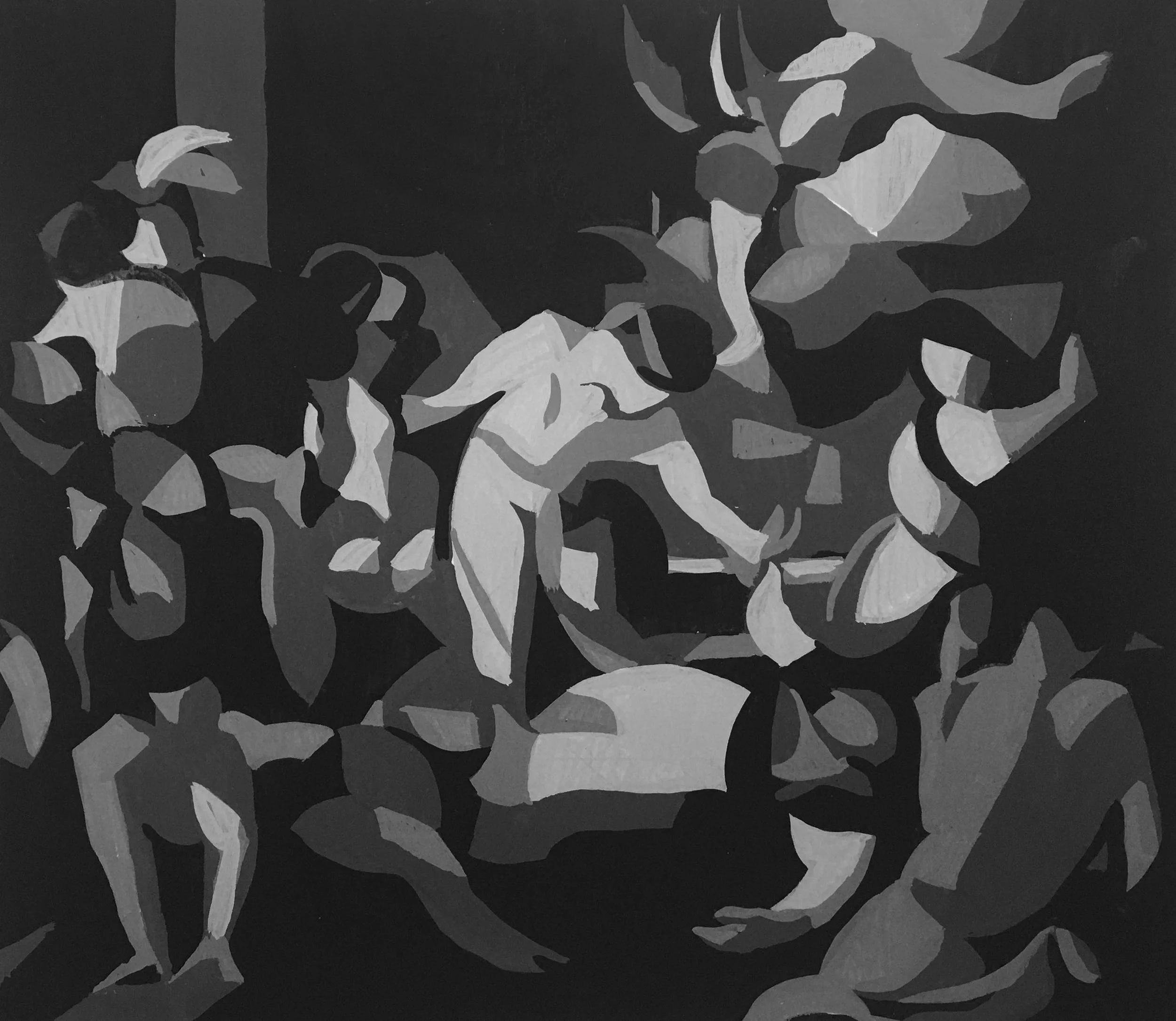
LESSON 5: Figure Collage /
Figure Design
Transform one of your Figure Sketches into a Figure Collage with limited Values. Create a dynamic context of shapes for the figure; consider the entire rectangle and every shape within it. No “floating” figures on a solid ground.

Paper Preparation:
In this example, I am using Golden Heavy-Body Acrylics, applied directly to the page (computer paper) and spreading it out with a palette knife. Keep it thick enough that the paint is nice and opaque. I recommend NOT spreading the paint to the very edges of the paper, as this creates a lot of mess.
After the pages dry, I cut-off the unpainted edges. You can press your stack of papers under a heavy book to flatten them if desired before using.
The “Origami” Technique:
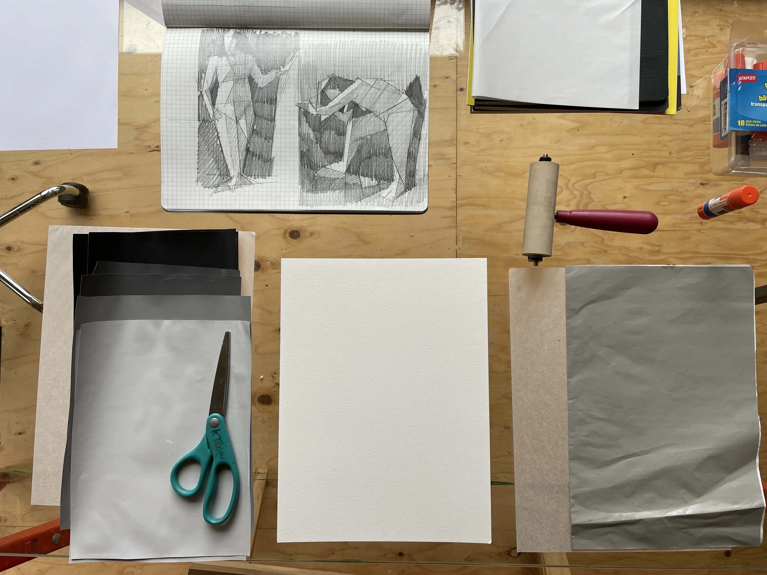
SUPPLIES: 4-Value Scale of Painted Papers, Sheet of Watercolor Paper (or other heavy paper for gluing-onto), Figure Sketch to work from, Blotter Paper for gluing (I am using a disposable palette paper), Tracing Paper, Rubber Brayer, Glue Sticks, Scissors.
PART I: Basic Block-In of major shapes. In real-time.
The “Paper Doll” Technique:
In these examples I am using card-stock for my paper.
Take it Further:
Make painted studies of your figure compositions using gouache and/or oils.
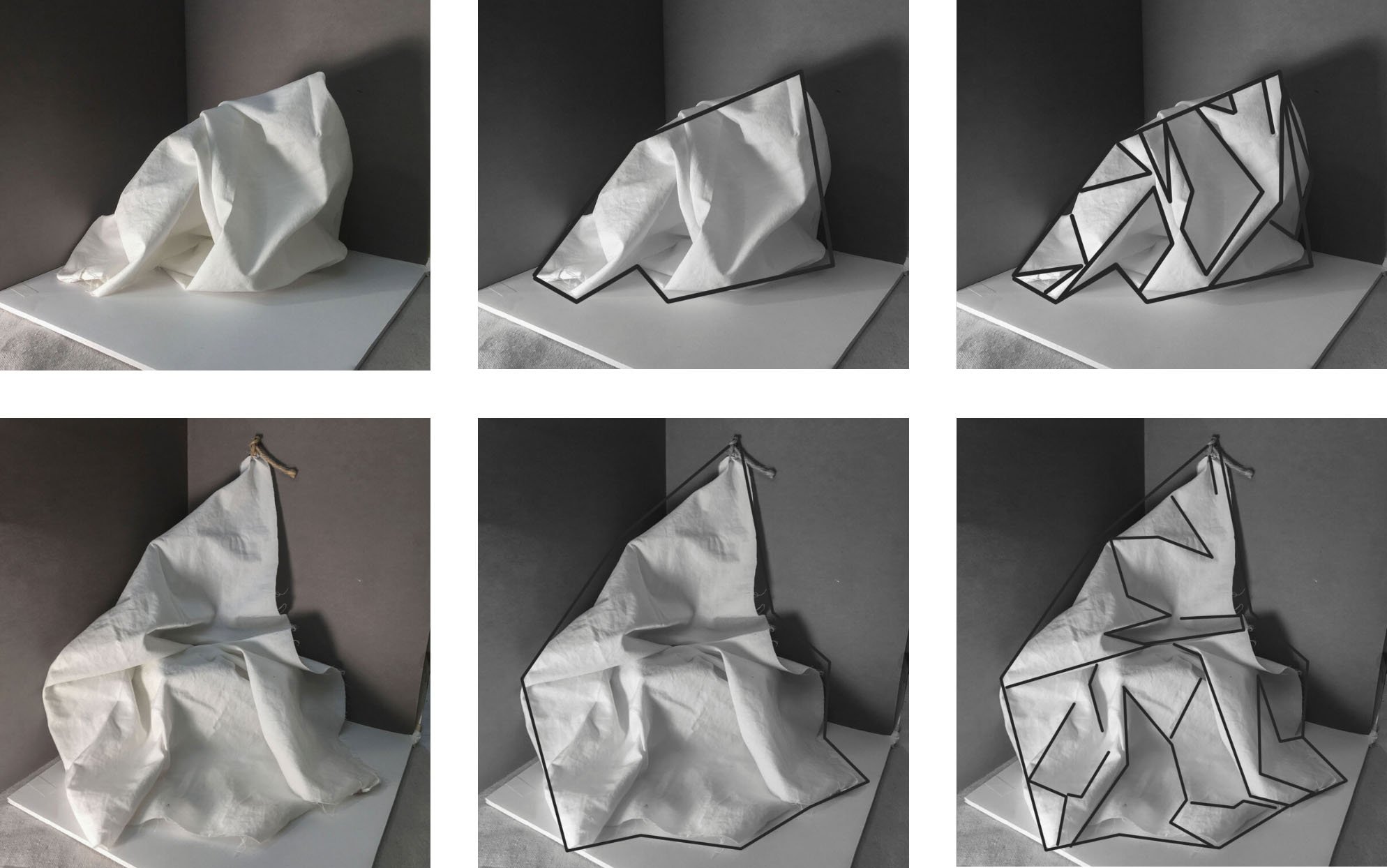
Lesson 6: Fabric / Structure & Sensuality
Create two oil paintings of fabric, around 12” x 16,” using 5-7 values.
One in Ivory Black; one in Mars Black.
Goals: A sensitive study of fabric that has a simple, planar, geometric foundation that upholds a series of more subtle, relative-value shifts.
This is an exercise in holding onto the big, structural shapes, while going into the smaller, more detailed nuances of form.
Step One: The Set-Up
Line your theater with black, gray, and/or white papers. Arrange a scrap of white fabric: In a heap on the floor, shrouding an object, suspended from the wall, etc. Fabric is very sensual and expressive. Move your light around to create a dynamic series of light and dark shapes. This will be a study in the subtle, relative values in the lighter range of your value scale. Look for larger zones of value to help you organize and group your hierarchy of values.
Step Two: The Drawing
In your sketchbook, get acquainted with the overall structure and shape of the fabric, and how it fits within your rectangle (composition). Start with the “envelope” and then notate the major shifts in value/structure.
Optional: Create a series of 3-Value gouache studies at this stage, keeping to the larger shapes.
Step Three: The Paintings
-Using your sketch as a guide, begin with a simple, linear gesture to divide your rectangle into its main shapes. In this example I am working on a 12” x 16” sheet of Arches Oil Paper.
-Block-in the larger shadow shapes with thinned-paint, using OMS.
-Next, using opaque mixtures of your value-scale, block-in the main shapes of value, covering the white of the page.
-Begin building-into some of the more subtle relationships and folds, using smaller brush strokes, slowing down, getting a tactile sense of the form. At this stage, it is a constant dance between the larger structure (notated in your sketch), and the smaller moments. It is a challenge to hold onto that larger, planar structure— to not dismantle it while paying close attention to details.

7-minute Speed Version
This is a 2-hour, Real-Time demo so that you can really get a sense of what it takes to build the painting from a general block-in to a more subtle rendering.
Swan
Did you too see it, drifting, all night, on the black river?
Did you see it in the morning, rising into the silvery air,
an armful of white blossoms,
a perfect commotion of silk and linen as it leaned
into the bondage of its wings: a snowbank, a bank of lilies,
biting the air with its black beak?
Did you hear it, fluting and whistling
a shrill dark music, like the rain pelting the trees, like a waterfall
knifing down the black ledges?
And did you see it, finally, just under the clouds –
a white cross streaming across the sky, its feet
like black leaves, its wings like the stretching light of the river?
And did you feel it, in your heart, how it pertained to everything?
And have you too finally figured out what beauty is for?
And have you changed your life?
– Mary Oliver

Lesson 7: Rocks & Fabric
This is our first major studio project and an opportunity to articulate and experiment with the concepts we’ve been developing, including: positive/negative, figure/ground, zones-of-value, value-as-design, relative-value, and technical narrative.
This is the time to go deeper-in.
You will create a series of oil paintings along with accompanying research materials in the form of sketches, templates, collages, and gouache studies as your practice guides you.
Postscript
And some time make the time to drive out west
Into County Clare, along the Flaggy Shore,
In September or October, when the wind
And the light are working off each other
So that the ocean on one side is wild
With foam and glitter, and inland among stones
The surface of a slate-grey lake is lit
By the earthed lightning of a flock of swans,
Their feathers roughed and ruffling, white on white,
Their fully grown headstrong-looking heads
Tucked or cresting or busy underwater.
Useless to think you’ll park and capture it
More thoroughly. You are neither here nor there,
A hurry through which known and strange things pass
As big soft buffetings come at the car sideways
And catch the heart off guard and blow it open.
-Seamus Heaney
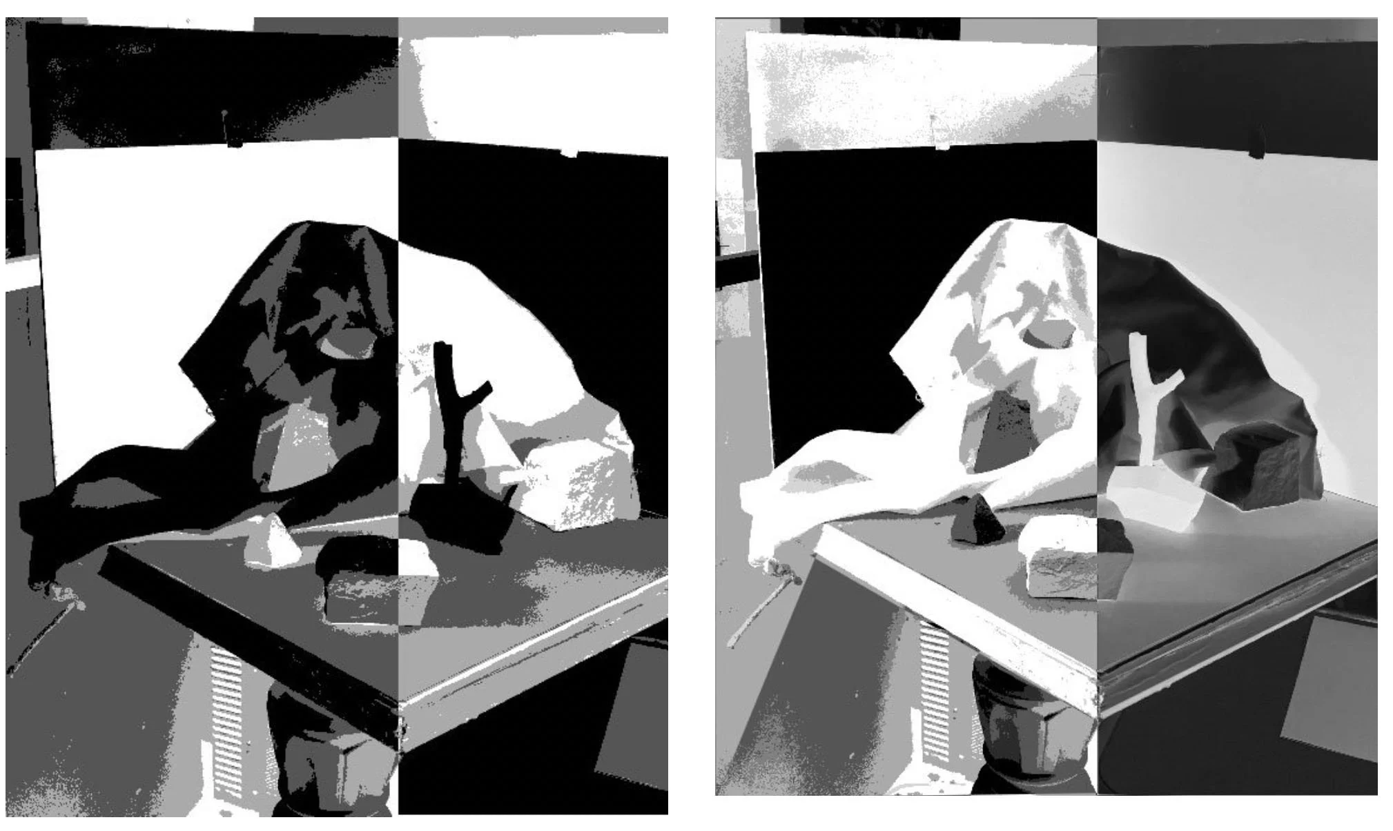
Part I: The Epic Theater
The first iteration of this project is to create a theater of interactions, using rocks, fabric, paper, etc. You want to create a scenario that is complex enough to challenge you, but simple enough for you to observe and articulate our concepts in value.
Some Guiding Principles for Your Theater:
-Create the set-up using mostly tonal objects (black, gray, white).
-Keep in mind contrasts: different values (light, med, dark); different sizes of objects and shapes within your composition (small, med, large).
-Use your light-source while you are setting it up. The shapes of light and shadow should be integral to the construction of your composition as the objects themselves.
-Think about the size of the paper or canvas (your format) that you would like to work on, and create your theater to be about a 1:1 relationship to that. Meaning, do not set-up a series of small objects to paint on a larger canvas. To work larger, expand your theater walls horizontally or vertically, or plan to include some of the surrounding space or environment.
-Consider “zones of contrast”- areas that drop into darker values, and areas of lighter values, to help create larger movements in your design. How do the lights or darks connect and create larger gestures through your composition?
-Be sure to turn/tune all of your objects to the light, in order to optimally display their planar structure. All objects should clearly show a light side and a shadow side. This simply makes them more interesting and dynamic to paint.
-Optional: use a master-painting to help guide some of your compositional decisions.


Your Research:
Throughout this process you will develop a series of studies to help inform your oil paintings. These studies can take the form of sketches, templates, collages, and gouache paintings to help you compose, experiment, inject new energy into, and ask new questions. Your research is a vital part of this process and should be directed by your own studio practice and journey. You have learned many strategies and tools this term. Use them. Play with them.
Research is Play. It’s a running dialog with your painting and is wonderfully generative. It is how we think-out-loud, in shapes and forms. It is how we develop a deep and meaningful relationship with our work.
The Oil Paintings:
You will make at least one, extended oil painting through direct observation of your theater. Use Mars or Ivory Black, or a combination of the two. Begin with a thinned, inky sketch and build-up the surface with mixed, opaque values. I like to start with just 3 values, and work my way up to 5 values. My final painting includes around 7 values, through inter-mixing, but I like to keep no more than 5 clear variations mixed on my palette. In my demo video below, you can see me working on this painting throughout several sessions, scraping it down multiple times, restructuring, rebuilding, until finally committing to a long, full, final session.
I often like to have a couple versions going at the same time, as a way to experiment and let my energy stay open and flowing. In this example, one remained a kind-of quick, wet-into-wet oil sketch, and a more zoomed-out view (on left); the other became a more focused, longer-term study. These are both painted on 20” x 16” Arches Oil Paper.
Technical Narrative:
Video Demo:
45 min video demo with some subtitles describing method and process. No audio.

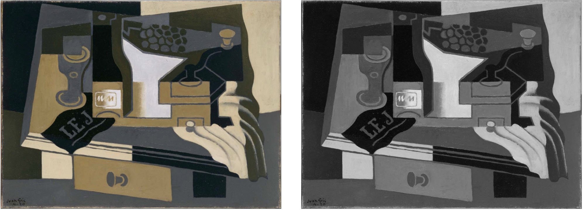
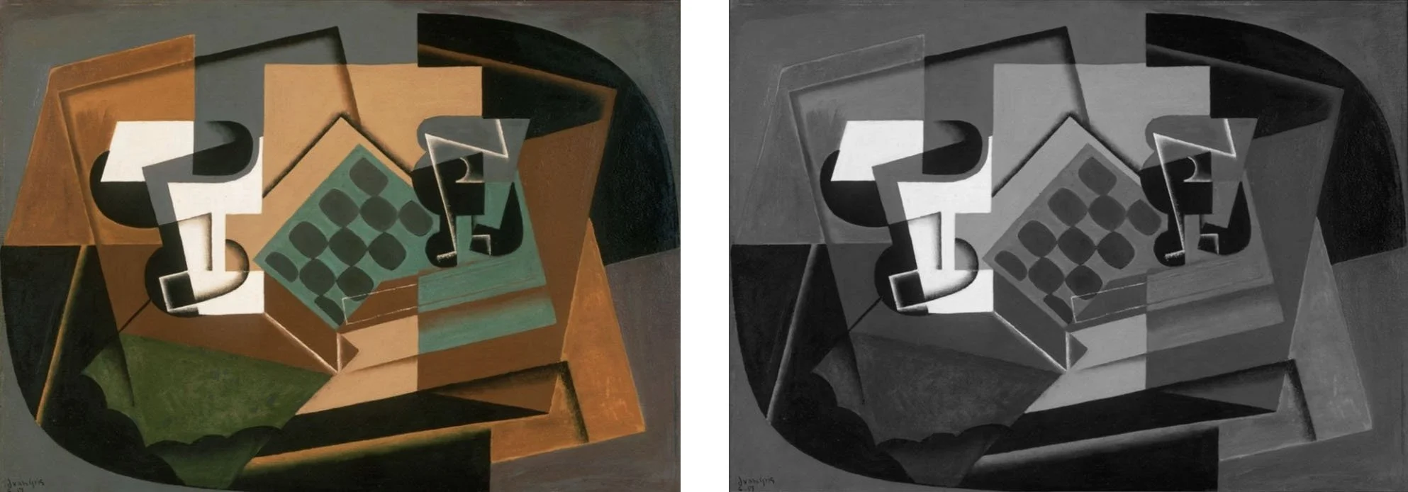
Part II: The Eclipse
A Cubist Remix Inspired by Juan Gris.
Using an assortment of tools and experiments including collage, hieroglyphics, gouache, mixed-media, technology (posterize, inversions), limited values, etc… Create a “cubist remix” version of Part I.

Thirteen Ways of Looking at a Blackbird
BY WALLACE STEVENS
I
Among twenty snowy mountains,
The only moving thing
Was the eye of the blackbird.
II
I was of three minds,
Like a tree
In which there are three blackbirds.
III
The blackbird whirled in the autumn winds.
It was a small part of the pantomime.
IV
A man and a woman
Are one.
A man and a woman and a blackbird
Are one.
V
I do not know which to prefer,
The beauty of inflections
Or the beauty of innuendoes,
The blackbird whistling
Or just after.
VI
Icicles filled the long window
With barbaric glass.
The shadow of the blackbird
Crossed it, to and fro.
The mood
Traced in the shadow
An indecipherable cause.
VII
O thin men of Haddam,
Why do you imagine golden birds?
Do you not see how the blackbird
Walks around the feet
Of the women about you?
VIII
I know noble accents
And lucid, inescapable rhythms;
But I know, too,
That the blackbird is involved
In what I know.
IX
When the blackbird flew out of sight,
It marked the edge
Of one of many circles.
X
At the sight of blackbirds
Flying in a green light,
Even the bawds of euphony
Would cry out sharply.
XI
He rode over Connecticut
In a glass coach.
Once, a fear pierced him,
In that he mistook
The shadow of his equipage
For blackbirds.
XII
The river is moving.
The blackbird must be flying.
XIII
It was evening all afternoon.
It was snowing
And it was going to snow.
The blackbird sat
In the cedar-limbs.
Digital Experiments:
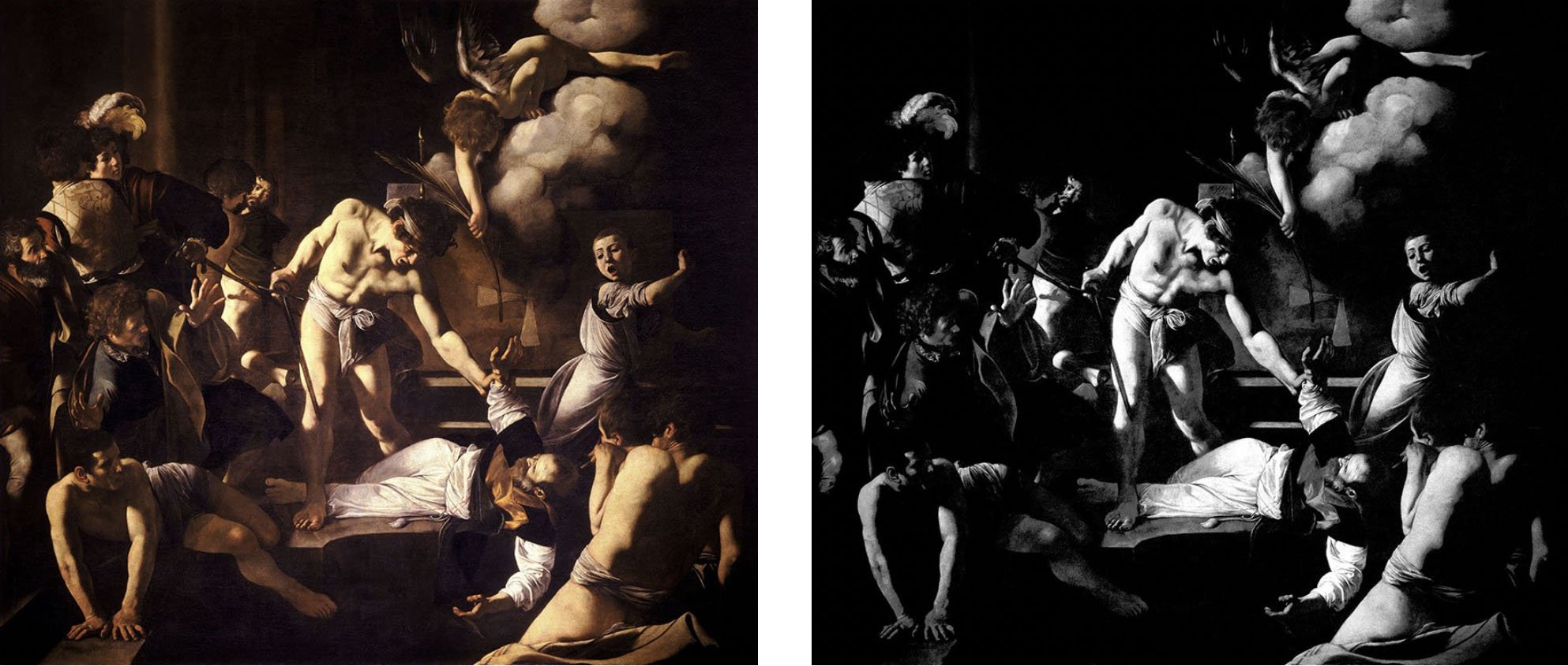
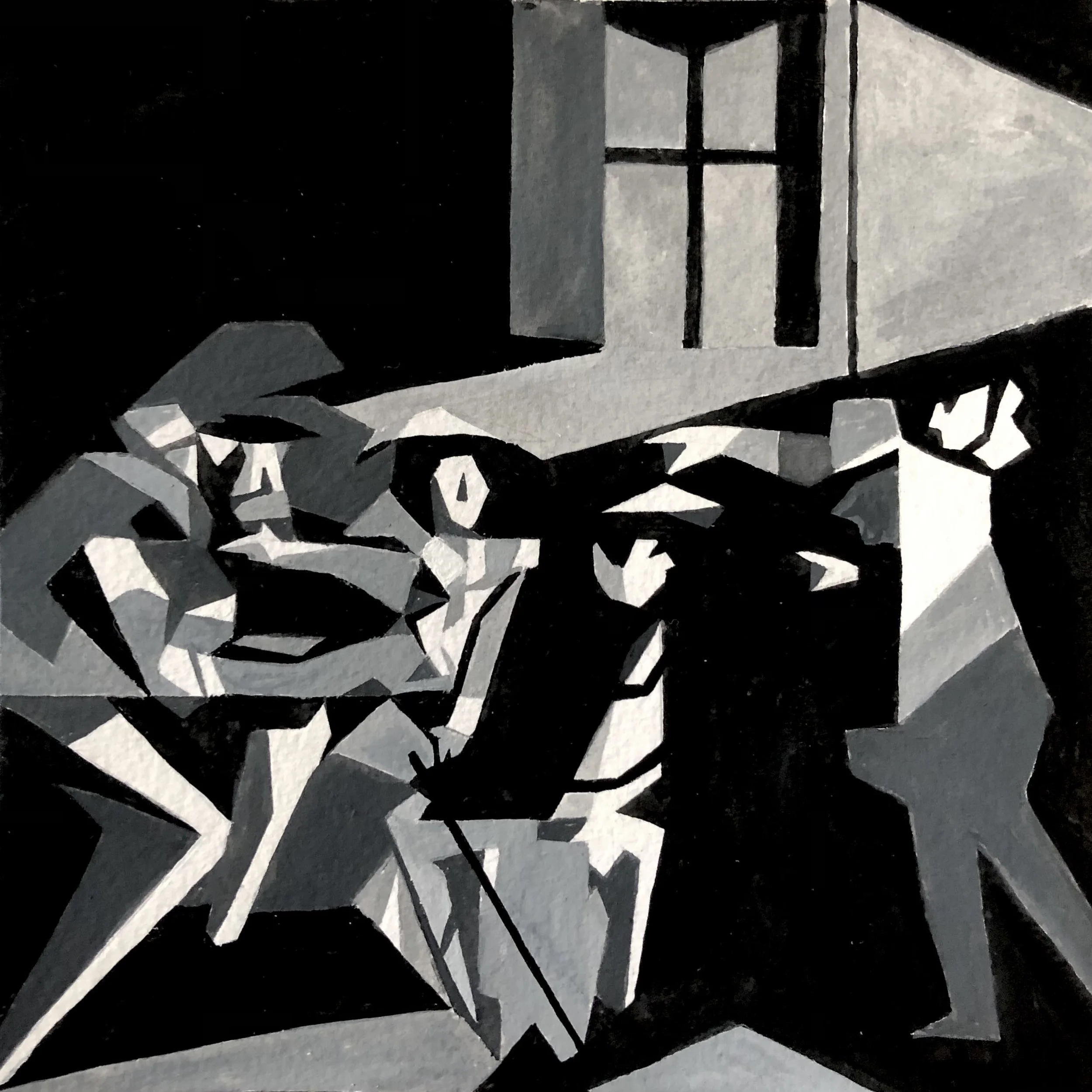
LESSON 8: A Caravaggio State of Mind:
Use your chosen Caravaggio image as a starting place for research; an excuse to go through many of the exercises and tools that we’ve rehearsed this past term, in any order and method that interests you.
For example:
Value Bones with Collage or Gouache.
“Keith Haring” the Figures and Environment in your Sketchbook.
Analyze the Composition with a Limited Value Scale in Pencil, Gouache, or Oils.

“Keith Haring” Sketch of Figures, Graphite Pencil on Paper

3-4 Value Block-In, Graphite Pencil on Paper
4 Value Block-In, Gouache on Paper
Other Examples:
Poetic Bones in Collage, after Caravaggio, by Lily Monsey
Poetic Bones in Gouache, after Caravaggio, by Sonja Haroldson
4-Value Gouache, after Caravaggio, by Kate Powell
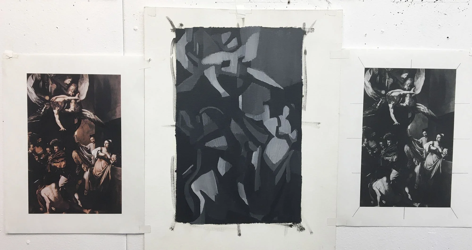
BW Oils, after Caravaggio
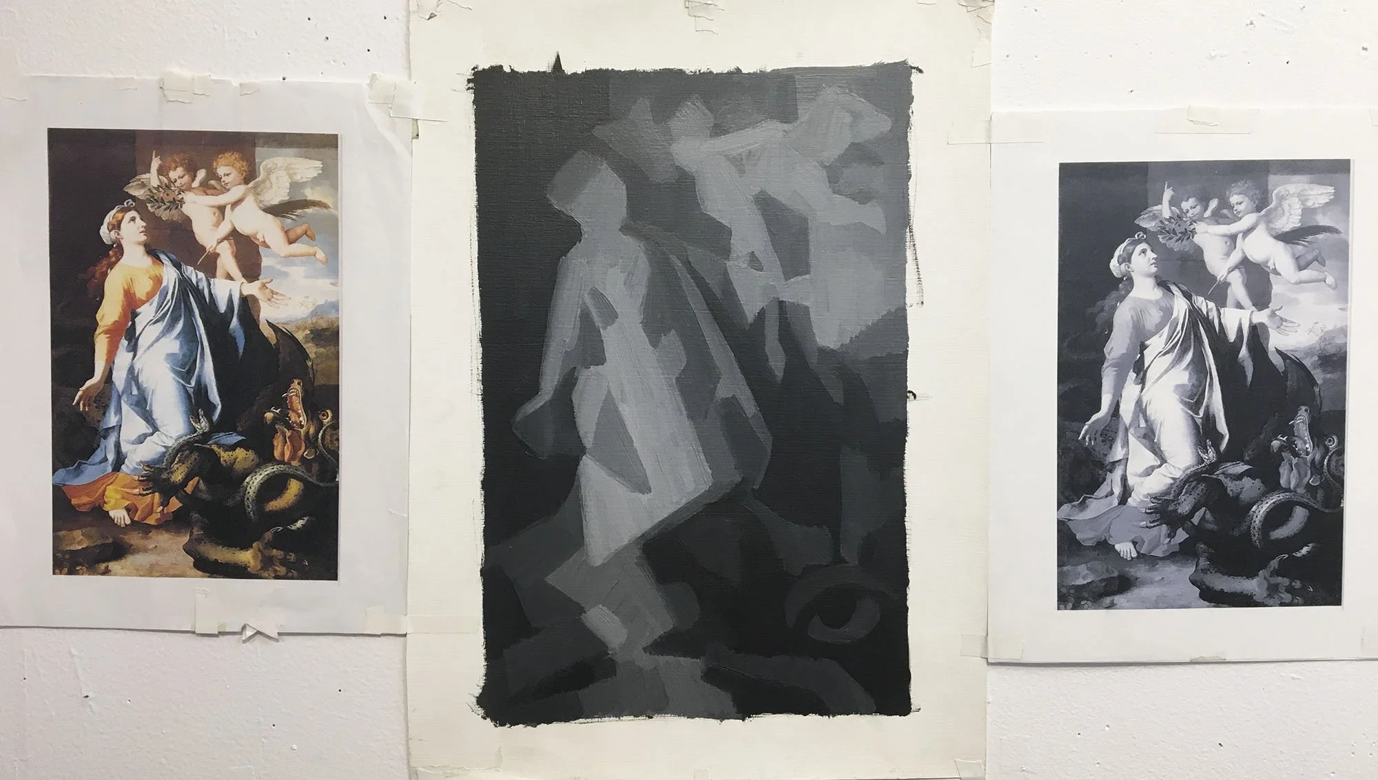
BW Oils, after Poussin
Lesson 9: A Little Warmth, Please
Using one of our scraped-down, 5-Value Rock Template Studies (Lesson 4), we will transition it from a Value painting into a Temperature painting. This is our very first tip-toe into color!…
Video Demonstration of Mixing a 5-Value palette with Mars Black and Titanium White, and then adding-on a column of Warmer Values by mixing-in Mars Yellow.
No Audio. Some explanatory subtitles.
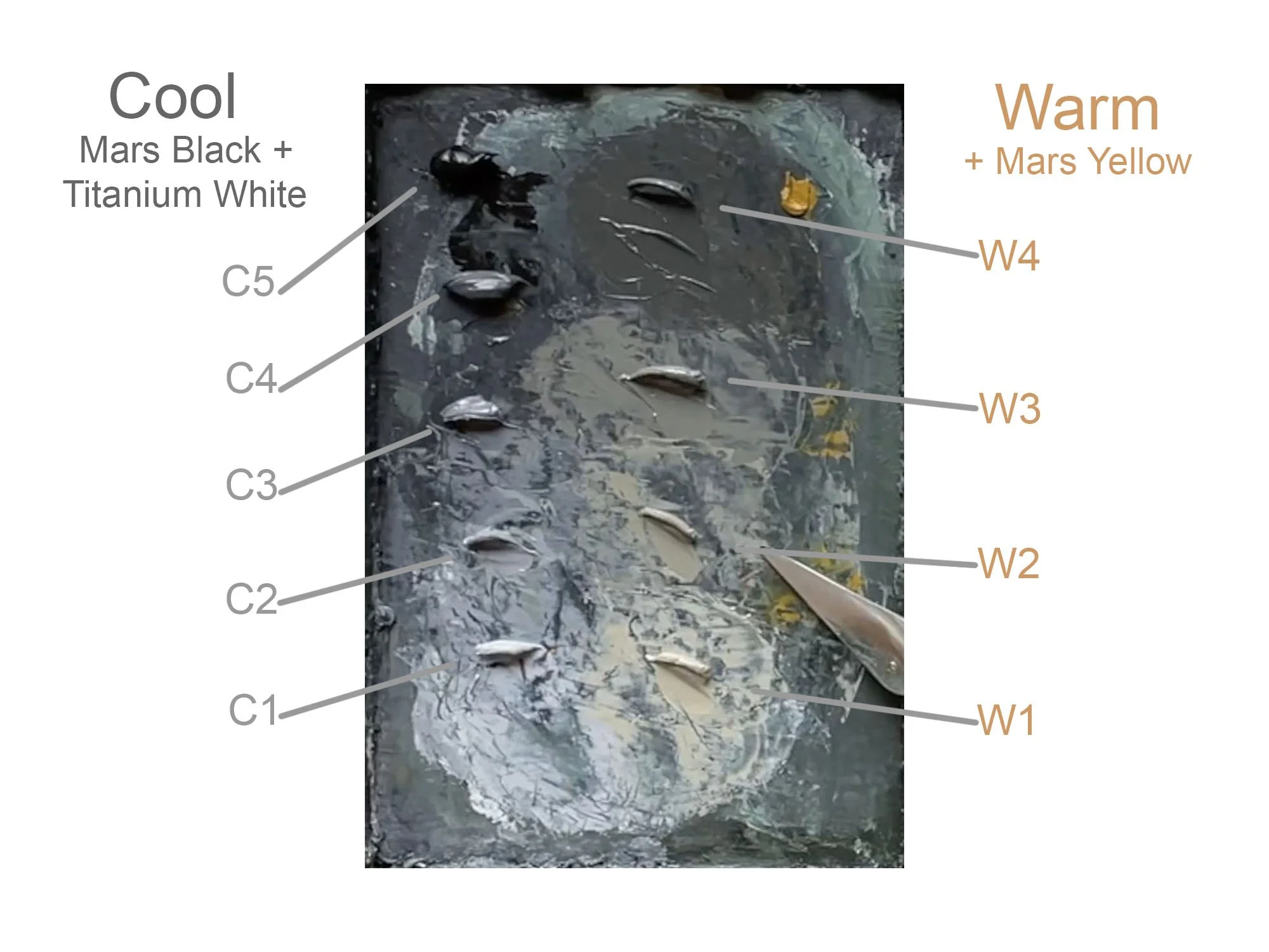
Our original value scale with Mars Black and Titanium White is tinted with a warmer pigment to create a column of warmer values. The column on the left becomes relatively cooler, compared to the new column on the right. We now have differences in Value, as well as Temperature. The cooler values will be reserved for any shadow planes or cast shadows on the painted study; the warmer tones will be applied to any planes that are facing, or being “touched” by, the source of light.

Video Demonstration of painting the Warmer Values on the planes that are "touched" by/ facing the light in my painted study. By doing so, we express a quality of light (temperature), in additional to the quantity (value).
No Audio. Some explanatory subtitles.
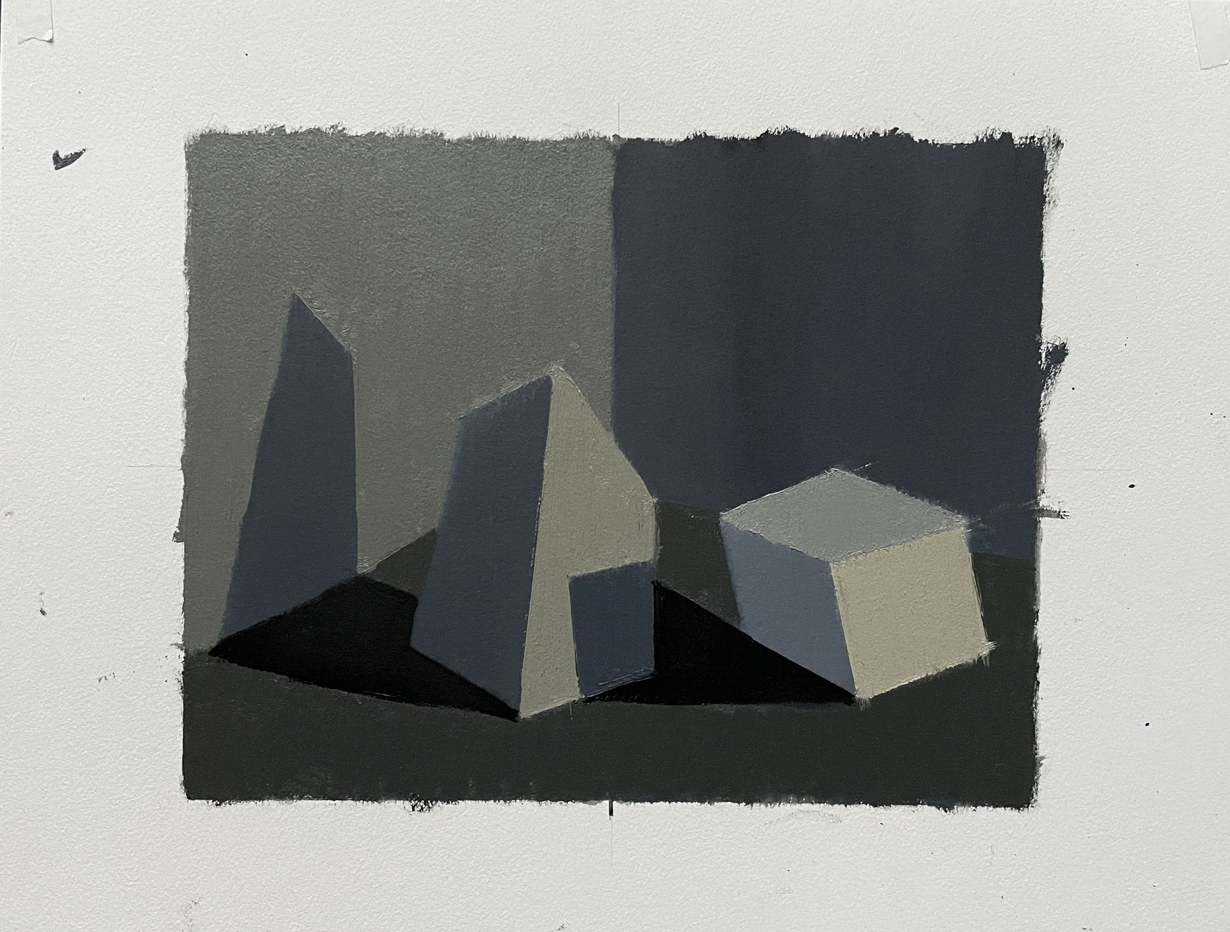
Lesson 10: Orange & Blue, Baby!
In this lesson you will learn how to mix a tertiary palette with the complement set Orange and Blue. You will learn how to create a color chart that notates the nuanced mixtures from your palette, and how to begin experimenting with those mixtures by applying them to a simple template.
Part I: Mixing a Tertiary Palette with a Complement Set
This video demonstrates how to mix a tertiary palette using the complement-set Orange/Blue. No Audio. Subtitles explain process and steps.
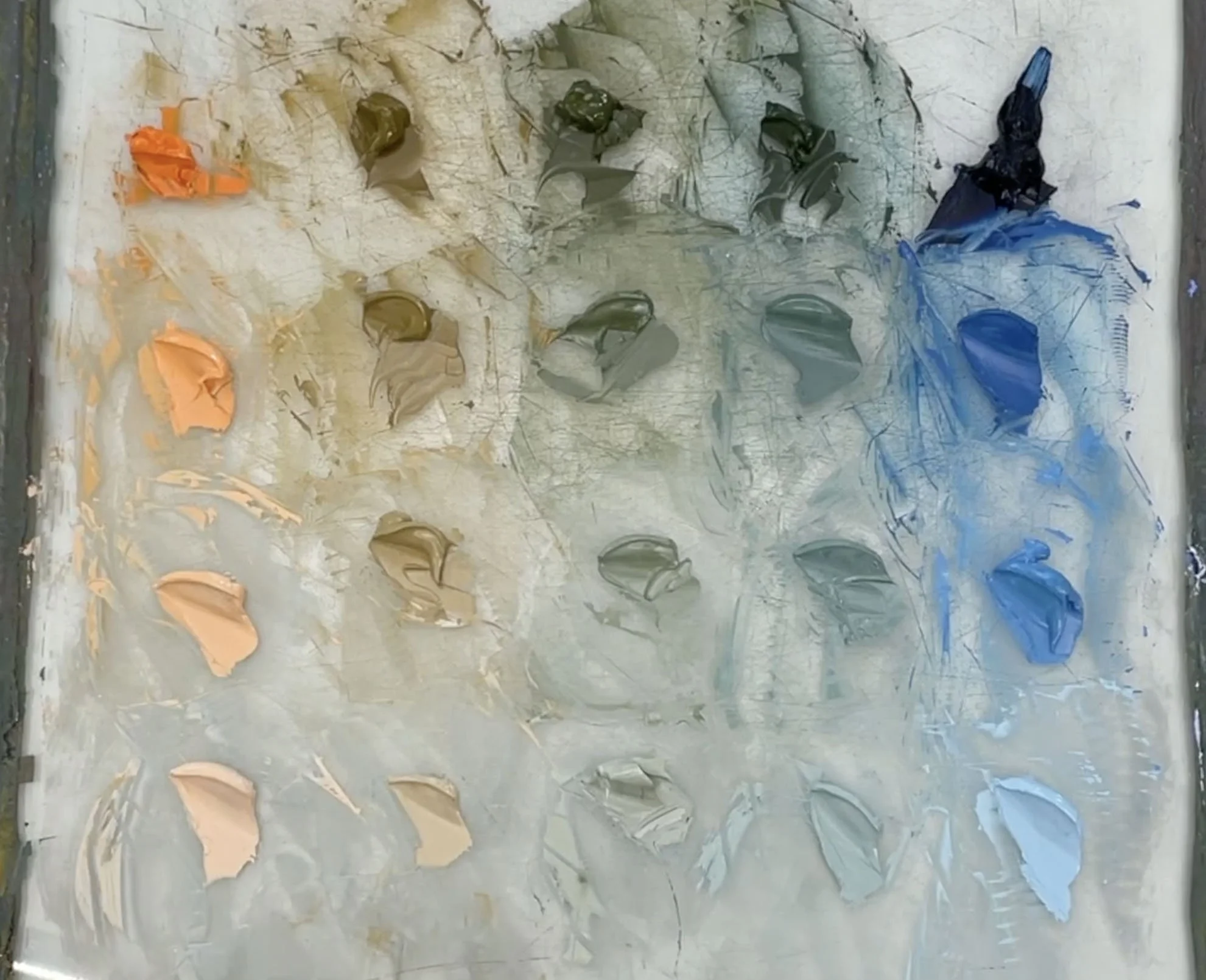
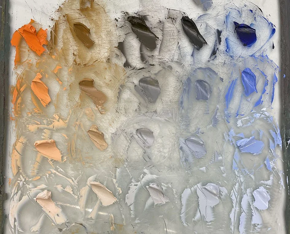
Cadmium Orange/ Prussian Blue
Cadmium Orange/ Ultramarine Blue
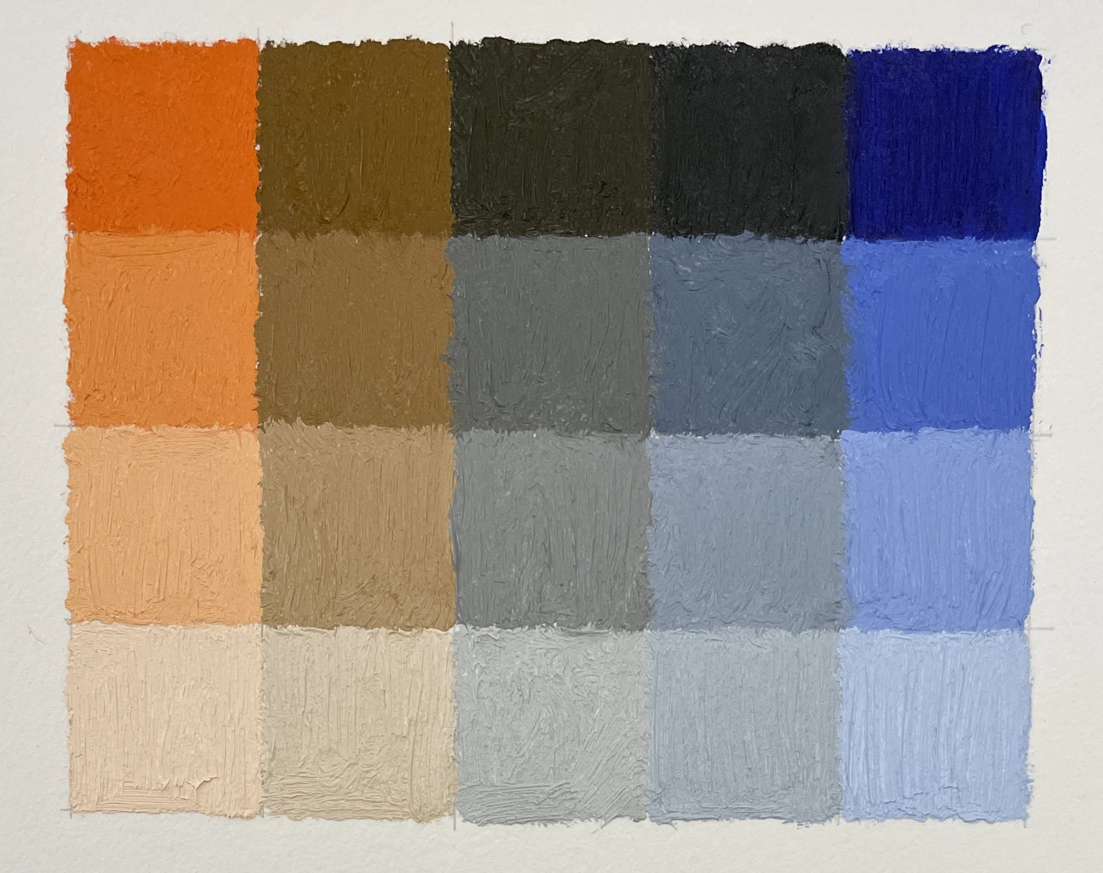
Part II: Painting-In a Color Chart
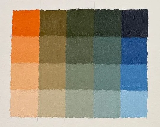
Cadmium Orange/ Prussian Blue
Cadmium Orange/ Ultramarine Blue
Part III: Applying Your Colors to a Box Template
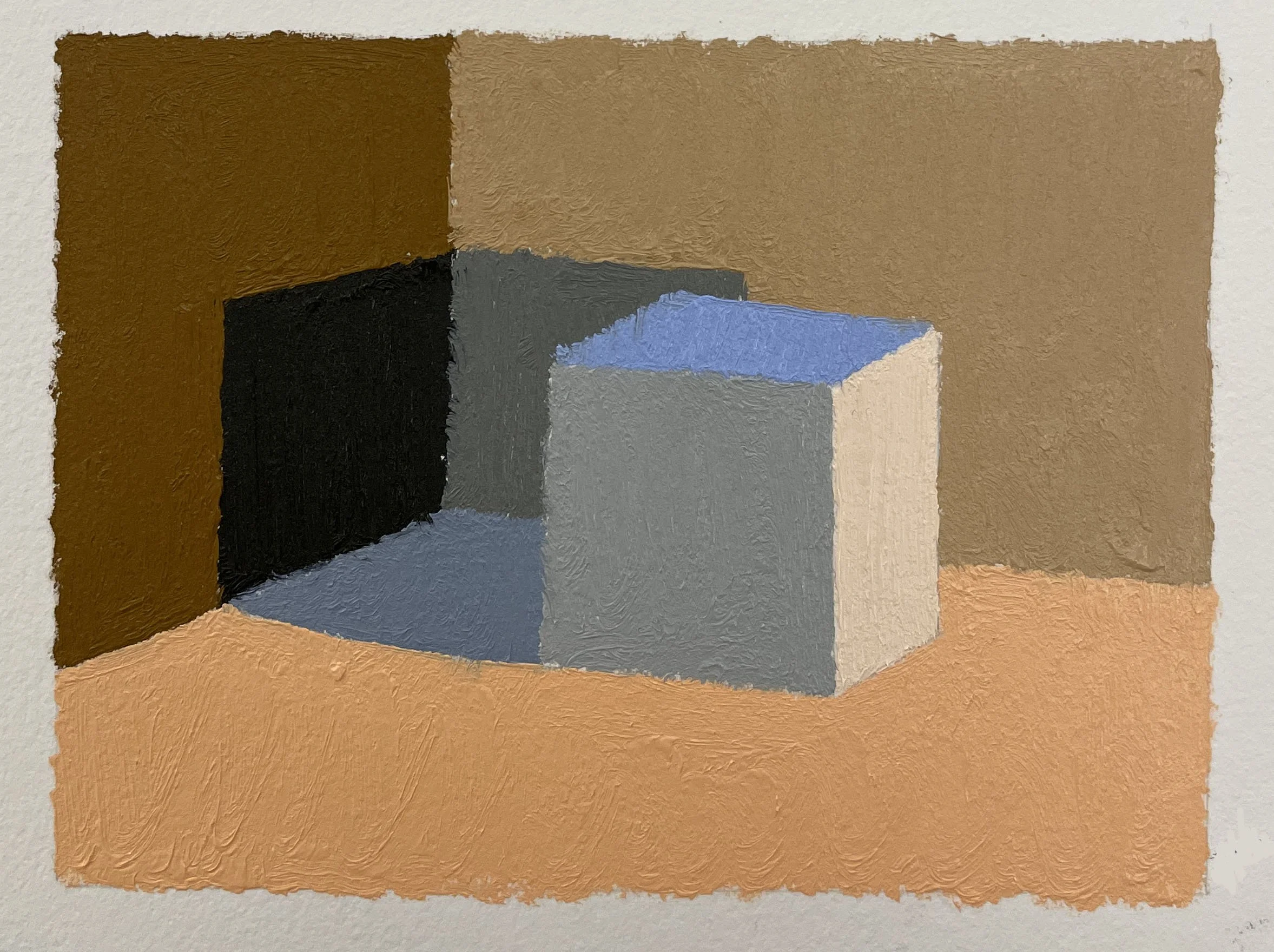
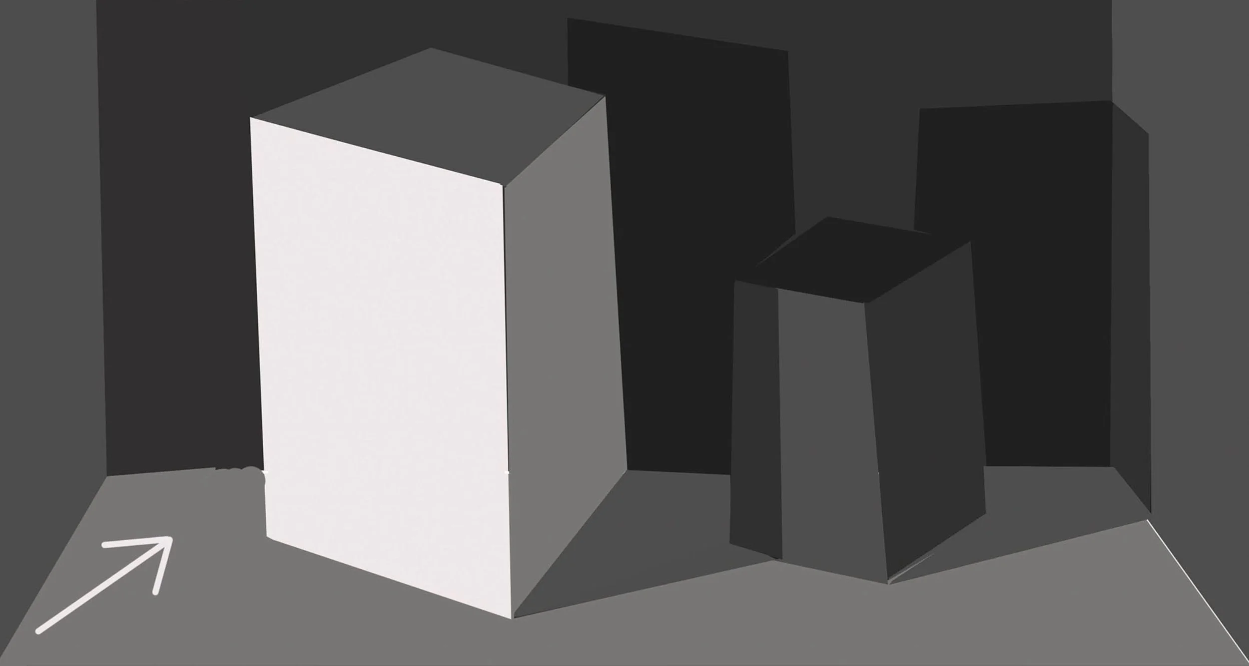
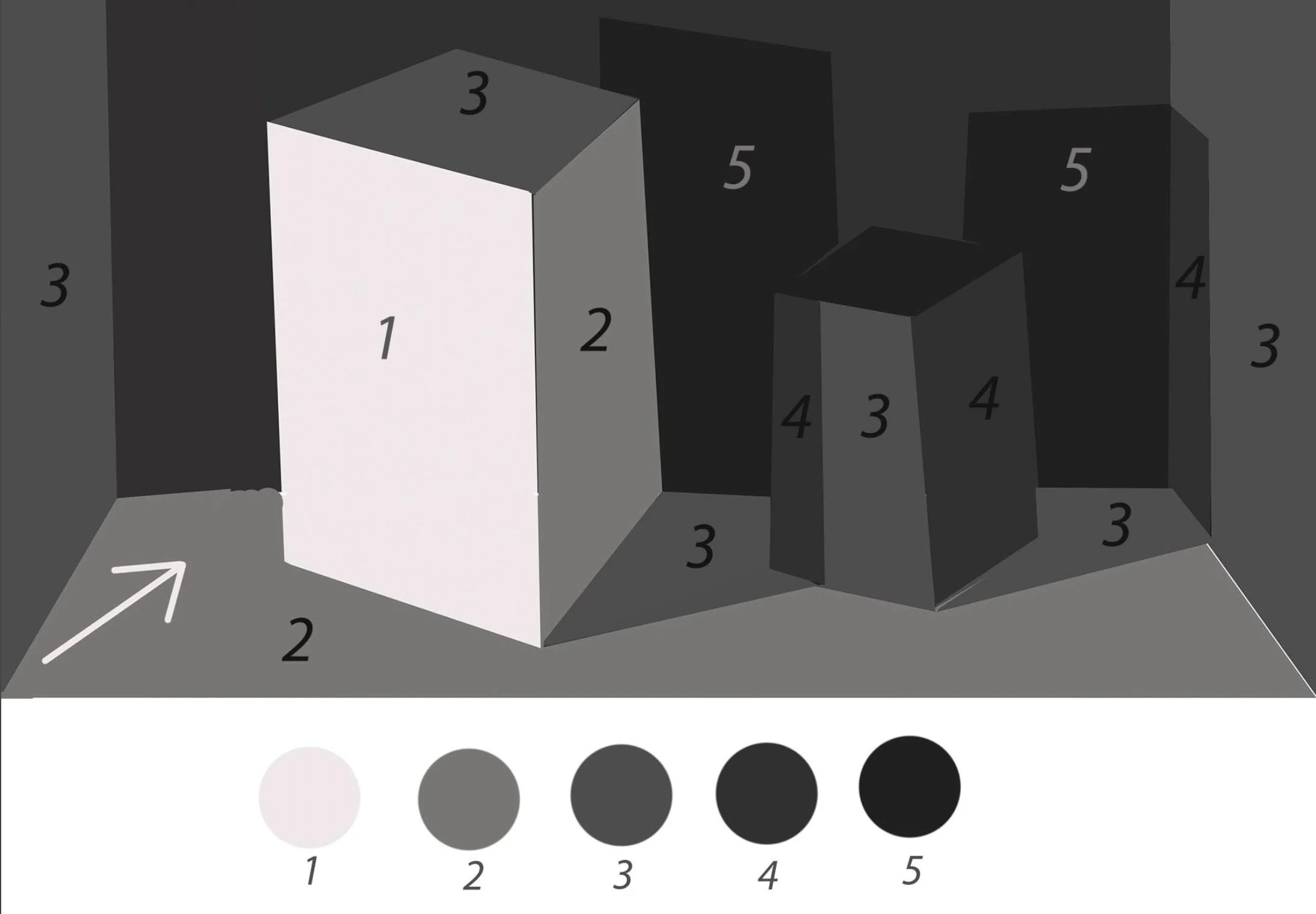
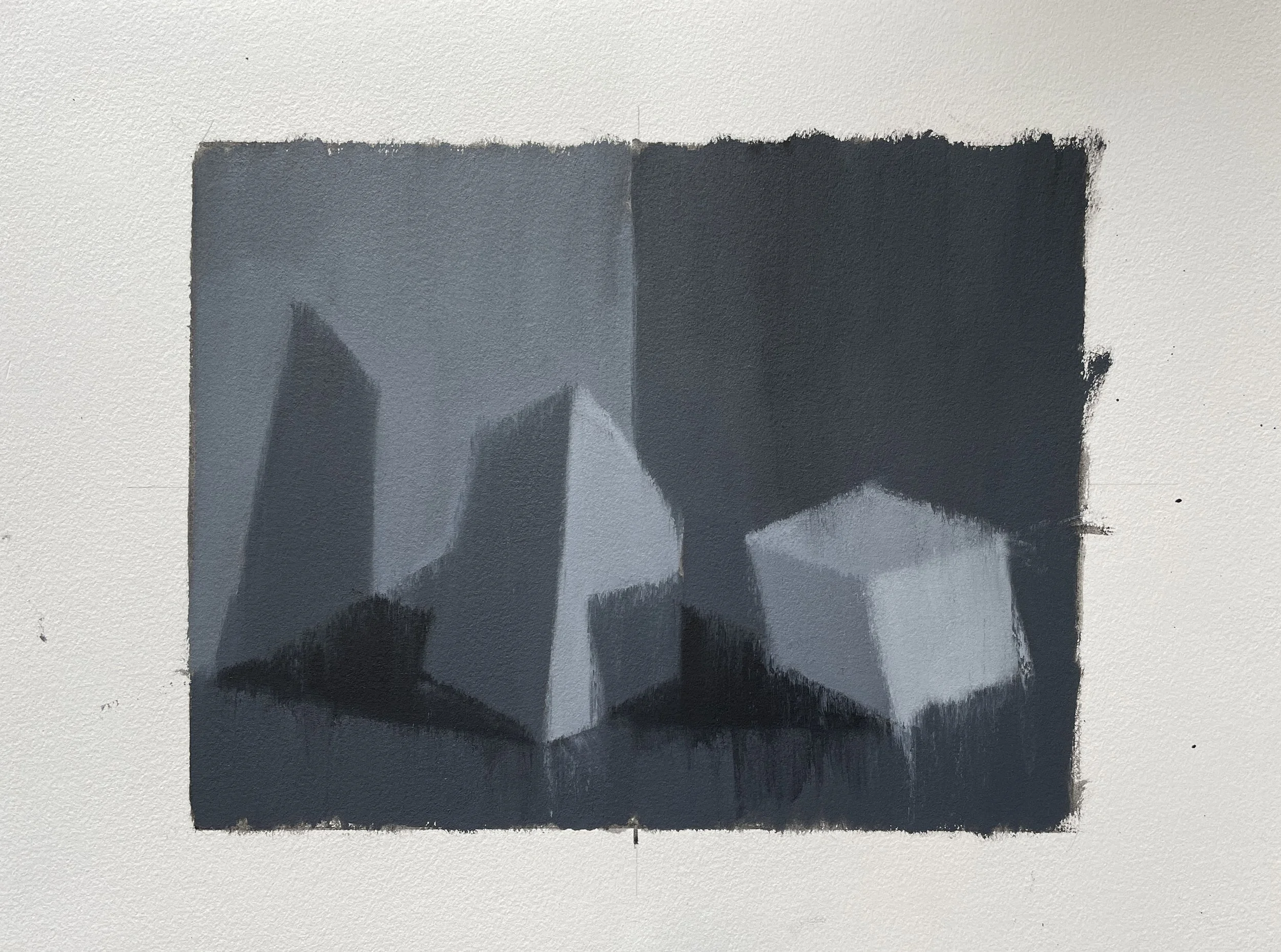
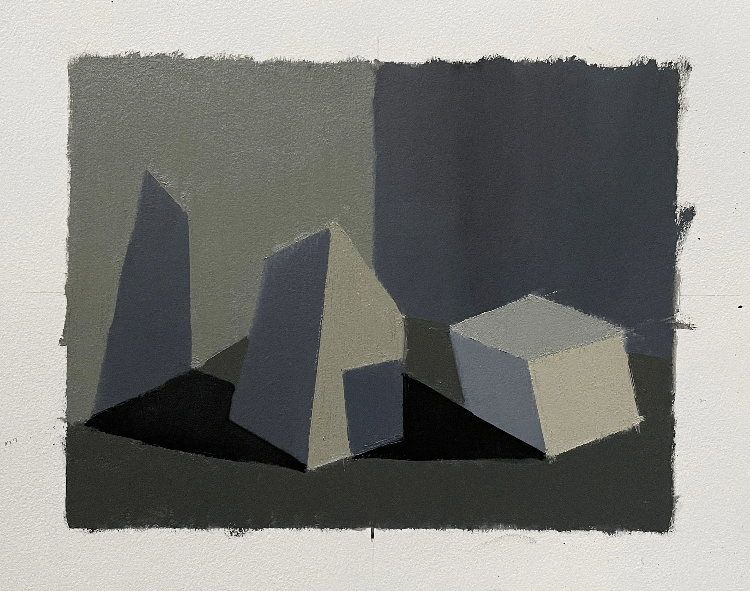
A crucial part of our color unit is learning to apply the mixtures we create from our color charts. This BOX diagram is a simple scenario we can use to begin understanding and experimenting with value and temperature relationships.
This diagram shows a cube casting a shadow on 3 different surfaces: 2 walls and a floor.
The labels “black wall”, “dark gray wall”, “light gray floor”, and “white box” are to indicate the relative value of these surfaces. Meaning, the shadow shape on the black wall must be your darkest value. The plane on the white box facing the direction of light will be your lightest value. The remaining value shapes fall somewhere in-between (use logic).
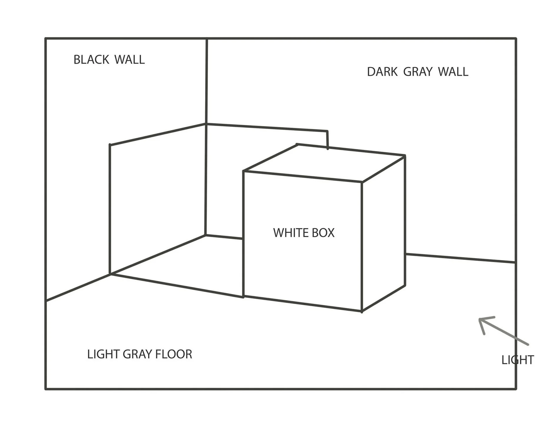
RULES for Painting-In Your Box-Templates:
1. The Relative Value of the Walls, Floor, and Box Must be Followed.
2. Temperature Relationships Must Follow Logic of the Assigned Temperature of the Light:
If light is warm, all shadows must be cooler; if light is cool, all shadows must be warmer.
3. Experiment and Break some of the Rules

Prussian Blue and Cadmium Orange
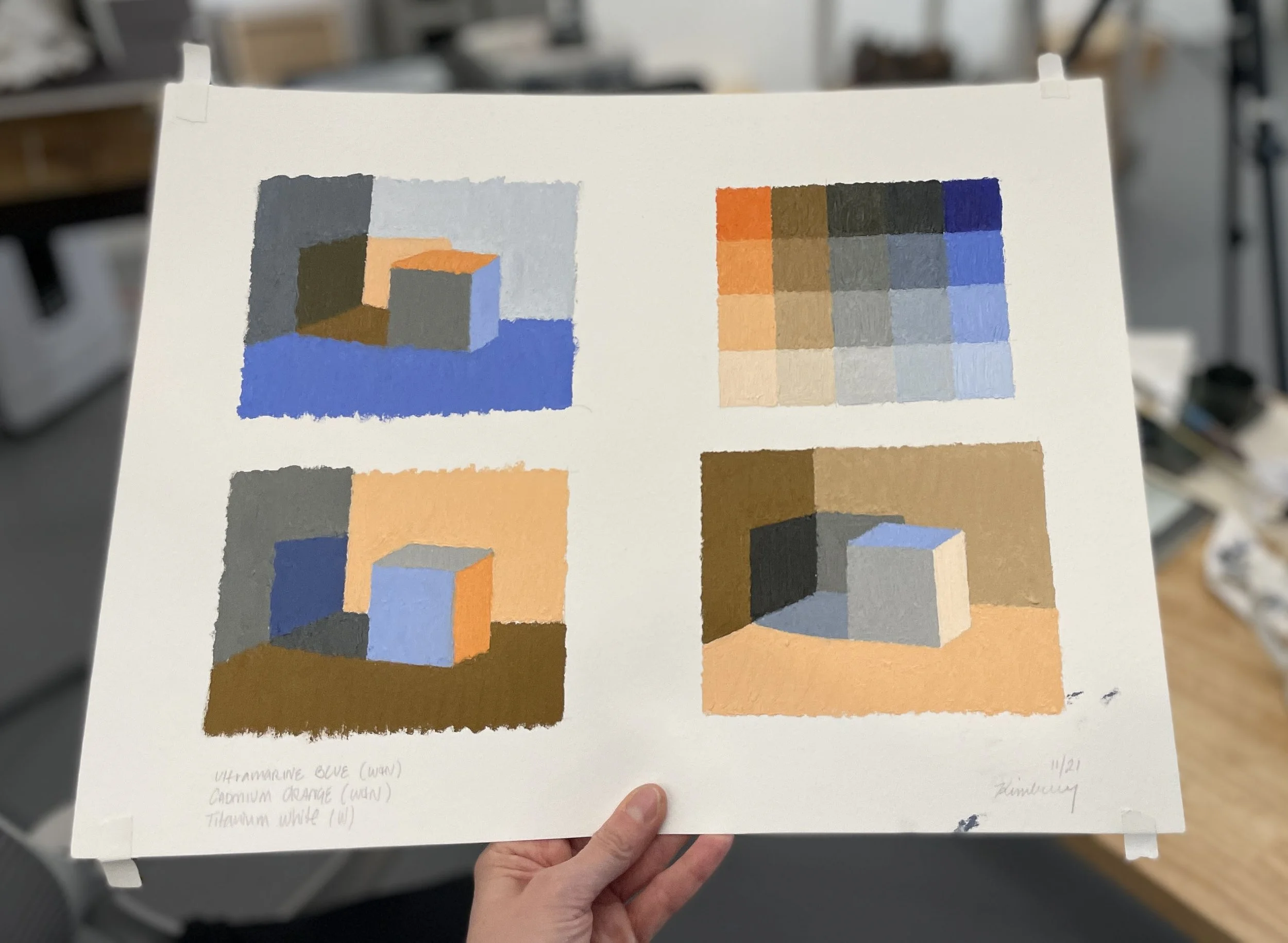
Ultramarine Blue and Cadmium Orange